Presenters: Wei Zhao, Alyssa Klein
In this session, we will provide detailed instructions for data mining with RNA-seq data. We will preview the following:
- Normalization of gene expression
- Differential gene expression analysis
- Clustering and visualization of gene expression
- Gene set and pathway enrichment analysis
- Identification of gene fusion
Today, we will be using 20 samples- 10 tumor samples and 10 normal samples (i.e. tumor-normal pairs). These samples are a subset of lung squamous carcinoma patients from the EAGLE study.
Preparation
Before doing anything else, we need to install several R packages needed for the session, and set up Biowulf.
Set up R Studio and install R packages
Open RStudio on your local machine. Use the following commands to install the necessary packages:
To install the DESeq2, tidyHeatmap, tidyverse, msigdb, GSEABase and GSVA packages in R, you can use the BiocManager::install() function.
# Install multiple packages at once
if (!require("BiocManager", quietly = TRUE))
   install.packages("BiocManager")

BiocManager::install(c("DESeq2", "tidyHeatmap", "GSVA", "tidyverse","msigdb", "GSEABase"))
Once the packages are installed, you can load them into R using the library() function:
library(DESeq2)
library(tidyHeatmap)
library(msigdb)
library(GSEABase)
library(GSVA)
library(tidyverse)
Log into Biowulf and set up interactive session
Before we begin, please login to Biowulf and request an interactive session:
For a reminder on how to log-in to Biowulf, we refer you to this Biowulf HPC guide.
In short:
- Windows users: use PuTTy
- Mac users: open your terminal and enter:
ssh $USER@biowulf.nih.gov
then enter your password: xxxxxx
After you log-in to Biowulf, please request an interactive session with the following command:
sinteractive --gres=lscratch:4 --mem=10g --cpus-per-task=4 --time=02:00:00
The sinteractive command is used to start an interactive session on a Slurm cluster. The –gres=lscratch:4 option specifies that the job should be allocated 4 Gb of local scratch space, which is a type of temporary storage that is typically used for high-speed I/O or as a workspace for computations. The –mem=10g option specifies that the job should be allocated 10 GB of memory. The –cpus-per-task=4 option specifies that the job should be allocated 4 CPU cores. The –time=02:00:00 option specifies that the job should be allowed to run for a maximum of 2 hours.
Copy/download the sample data from Biowulf
While still on Biowulf use the following commands to set up the session:
1. Change the directory to the data directory:
cd /data/$USER
2. Create a directory for this practical session using the following command:
mkdir practical_session_11
3. Move to that directory so that it becomes your working directory and check that you are now in this directory:
cd practical_session_11
pwd
4. Copy all the data for this practical session to practical_session_11:
cp -R /data/classes/DCEG_Somatic_Workshop/Practical_session_11/scripts .
cp -R /data/classes/DCEG_Somatic_Workshop/Practical_session_11/Fusion_Output .
Copy/download the sample data- Local Machine
There will be several files needed for this session on your local machine. Click here to download the necessary files for these sections.
You will see that you have downloaded a zip file. Unzip this file so that you now have a Practical_session_11/ folder with several different files. We will begin using some of these files in the next step.
Normalization
If you attended session 10 last week, you may remember that we finished our workflow with the quantification step using htseq. We are going to take a different subset of raw count data that was also generated using htseq, and use it to perform normalization.
Normalization is the process of scaling raw count data to account for a variety of factors in order to ensure an accurate comparison is being made of gene expression between samples.
There are several factors to consider when carrying out normalization. These include:
- Sequencing depth- A sample with greater sequencing depth could appear to have greater expression than a sample with a lesser sequencing depth.
- Gene length- While genes may have similar levels of expression, the number of reads mapping to one gene could be much higher than another gene simply due to a much greater gene length.
- RNA composition- Normalization can be skewed or inaccurate if there are a few highly differentially expressed genes between samples, difference in the number of genes expressed between samples, or presence of contamination.
There are several normalization methods to choose from, and so we are only going to focus on one today, DESeq’s method of normalization. We have also included an additional normalization method, TPM, under the Supplemental section of the course website.
DESeq normalization
The method we will be using for normalization today is the DESeq method, known as the median of ratios. This is a method where counts divided by sample-specific size factors are determined by the median ratio of gene counts relative to geometric mean per gene, taking into account sequencing depth and RNA composition.
This normalization will be carried out in R. You should have downloaded and unzipped the zip file that contains all of the necessary files for this part of the practical. Unzip this file and open the scripts/Practical_session_11_normalization_DE.R file. This will open in RStudio.
Since we already loaded the packages in a previous preparation section, we need to make sure we are in the correct working directory. The following code can be found in lines 23-32 of the script. First, make sure you are in the correct directory by using the getwd() command. The directory should be:
- Mac
/Users/[username]/Downloads/Practical_session_11/ - Windows
C:/Users/[username]/Downloads/Practical_session_11/
If you are not in the right directory, use the setwd() command:
setwd("/Users/[username]/Downloads/Practical_session_11/")
First, we will read in the necessary files to run the DESeq’s normalization method. These files include a sample annotation file (Practical_11_samples_clinical.txt) and the htseq raw count data (Practical_11_htseq_counts.txt).
# read in sample annotations
metadata <- read_delim('Practical_11_samples_clinical.txt')

# read in raw counts output from htseq
htseq_output <- read_delim('Practical_11_htseq_counts.txt') %>% data.frame()

# rename UID to gene_name (to be used later)
htseq_output <- dplyr::rename(htseq_output, gene_name = UID)

# set row names to gene names and remove the gene_name column (the first column in the dataframe)
rownames(htseq_output) <- htseq_output$gene_name
htseq_output <- htseq_output %>% select(-1)
We can look at the first few lines of each of these files to get an idea of the format of each:
head(metadata) %>% View()

head(htseq_output) %>% View()
Next, we will need to create a DESeqDataSet, which is an object to store our count data, annotation data, and analysis design.
Before doing this, we need to make the variables we will be putting into our model into factors, so that the variables have levels for comparison, including a reference level. Today, we will be including tumor stage (1, 2, and 3) and type (tumor vs. normal) in our design.
You will see that we recode the STAGE variable to a new variable, stage, with levels 1, 2, and 3.
# set up variables to include in the model- Type (Tumor vs. Normal) and stage (1,2,3)
# need to set up as factors with the appropriate reference level
metadata$Type <- factor(metadata$Type, levels = c("Normal", "Tumor"))
# recode the original STAGE variable to a new variable, stage, with levels 1, 2, and 3
metadata <- metadata %>%
    mutate(stage=case_when(str_detect(STAGE,'^I[AB]')~1,
                         str_detect(STAGE,'^II[AB]')~2,
                         str_detect(STAGE,'^III[AB]')~3,
                         TRUE~888
                         ))
metadata$stage <- factor(metadata$stage, levels = c("1", "2", "3"))
We then check that our column names in our raw counts are in the same order as the sample annotation sample IDs:
all.equal(colnames(htseq_output), metadata$UID)
# [1] TRUE
This is extremely important when using the DESeq method because it will not guess which column of the count matrix belongs to which row of the metadata.
Now we set up the DESeqDataSetFromMatrix to generate our DESeqDataSet.
# set up function to generate a DESeqDataSet
# using our htseq raw counts, sample annotations, and our model (which includes stage and Type)
dds <- DESeqDataSetFromMatrix(countData = htseq_output,
                              colData = metadata,
                              design= ~ stage + Type)
Then we filter out any genes with low counts.
# filter out any genes where the read counts across samples are not greater than or equal to 10
keep <- rowSums(counts(dds)) >= 10
dds <- dds[keep,]
Now we are ready to normalize. As mentioned in the brief description of DESeq’s normalization method, DESeq will estimate size factors for each sample in order to derive the normalized counts. Then, we use the counts() function to extract the normalized counts.
# normalization steps
dds <- estimateSizeFactors(dds)
normalized_counts <- counts(dds, normalized=TRUE)
normalized_counts <- data.frame(normalized_counts)
normalized_counts <- normalized_counts %>% mutate(gene_name = rownames(normalized_counts), .before = 1)
We can then save this normalized count data to a file.
# save normalized counts to a file
write_delim(data.frame(normalized_counts), file = 'htseq_normalized_DESeq.csv', delim = ',')
These normalized counts can be used in some downstream analyses, but not all (ex. differential expression using DESeq method uses raw counts).
Principal Component Analysis (PCA)
PCA is a dimension reduction technique that helps to find the greatest amounts of variation in a dataset and assigns it to principal components. PC1 is the component that explains the greatest variation, and PC2 the second. (There can be several additional principal components). PCA can help to identify sources of batch effects, especially in larger datasets.
Today we will use the DESeq2 package for generating a few PCA plots that include our variables of interest that will be included in our model for differential expression.
We begin as if we have not done anything with the data yet by reading in our required inputs. We read in each of our inputs (raw counts and sample annotations), and then set up our variables of interest to be factors.
# starting over as if this is the first step before setting up DE analysis
# read in sample annotations
metadata <- read_delim('Practical_11_samples_clinical.txt')

# read in raw counts output from htseq
htseq_output <- read_delim('Practical_11_htseq_counts.txt') %>% data.frame()

# rename UID to gene_name (to be used later)
htseq_output <- dplyr::rename(htseq_output, gene_name = UID)

# set row names to gene names and remove the gene_name column (the first column in the dataframe)
rownames(htseq_output) <- htseq_output$gene_name
htseq_output <- htseq_output %>% select(-1)

# set up variables to include in the model- Type (Tumor vs. Normal) and stage (1,2,3)

# need to set up as factors with the appropriate reference level
metadata$Type <- factor(metadata$Type, levels = c("Normal", "Tumor"))

# recode the original STAGE variable to a new variable, stage, with levels 1, 2, and 3
metadata <- metadata %>%
  mutate(stage=case_when(str_detect(STAGE,'^I[AB]')~1,
                         str_detect(STAGE,'^II[AB]')~2,
                         str_detect(STAGE,'^III[AB]')~3,
                         TRUE~888
  ))
metadata$stage <- factor(metadata$stage, levels = c("1", "2", "3"))
We then check that our column names in our raw counts are in the same order as the sample annotation sample IDs:
all.equal(colnames(htseq_output), metadata$UID)
# [1] TRUE
This is extremely important when using the DESeq method because it will not guess which column of the count matrix belongs to which row of the metadata.
We set up a DESeqDataSet and then filter out any genes with low counts.
# using our htseq raw counts, sample annotations, and our model (which includes stage and Type)
dds <- DESeqDataSetFromMatrix(countData = htseq_output,
                              colData = metadata,
                              design= ~ stage + Type)

# filter out any genes where the read counts across samples are not greater than or equal to 10
keep <- rowSums(counts(dds)) >= 10
dds <- dds[keep,]
Then we run a vst normalization in order to generate a PCA plot with normalized counts. The vst normalization stands for variance stabilizing transformation. You can read more about this method here. Note: There are additional transformation approaches, including rlog, or log + 1, which you will see later. We use vst due to its speed and effectiveness.
dds_norm <- vst(dds)
We can generate a PCA for Type (Tumor vs Normal) only, stage only, or stage and Type. Code for each of these has been included in the script. However, we will focus on stage and Type on the same PCA plot.
plotPCA(
  dds_norm,
  intgroup = c("Type", "stage")
)
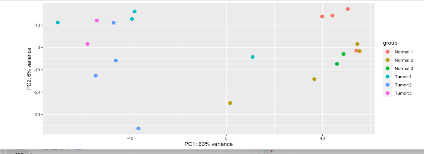
If we look at this first plot, we see 63% of the variance explained on the x-axis, and 6% on the y-axis. However, it is a bit difficult to tell if these variables are causing the variations due to the levels within each in the difficult-to-discern legend.
Instead, we can save the data output with this PCA plot to make a more aesthetically-pleasing plot using ggplot2.
pca_results <- plotPCA(
  dds_norm,
  intgroup = c("Type","stage"),
  returnData = TRUE
)

annotated_pca_plot <- ggplot(
  pca_results,
  aes(
    x = PC1,
    y = PC2,
    # plot points with different colors for tumor vs normal
    color = Type,
    # plot points with different shapes for each stage
    shape = stage
  )
) +
  # Make a scatter plot
  geom_point()

# display annotated plot
annotated_pca_plot
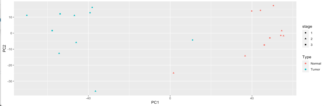
Now we can clearly see that variation in the dataset is coming mainly from Type, as Tumor and Normal samples are on the complete opposite ends of the plot. Stage appears to attribute to some variation, but minimal.
Differential Expression (DE) Analysis
Now we will run a differential expression (DE) analysis. Differential expression analysis helps determine if genes are differentially up/down regulated with respect to our variable of interest (exposure, status, etc.). Please see the lecture slides for additional information.
One important part of differential expression using DESeq2’s DESeq() function is that it requires raw counts as input- not normalized counts. Therefore, we will not be using the normalized count files we generated in the previous part. Those can be used for other parts of the analysis workflow.
Since we set up the DESeqDataSet and variables in the PCA plot generation step, we jump right into running DESeq(). This will take about 30 seconds to 1 minute to complete.
# run DESeq for differential expression
dds <- DESeq(dds)

estimating size factors
estimating dispersions
gene-wise dispersion estimates
mean-dispersion relationship
final dispersion estimates
fitting model and testing
When DESeq is finished running, we can start exploring the results, using the results() function.
# pull results of differential expression with FDR of 0.05 and log fold change of at least 1
res <- results(dds, alpha =0.05, lfcThreshold=1)
res
Let’s take a look at our results table. You will see that it includes…
head(res)
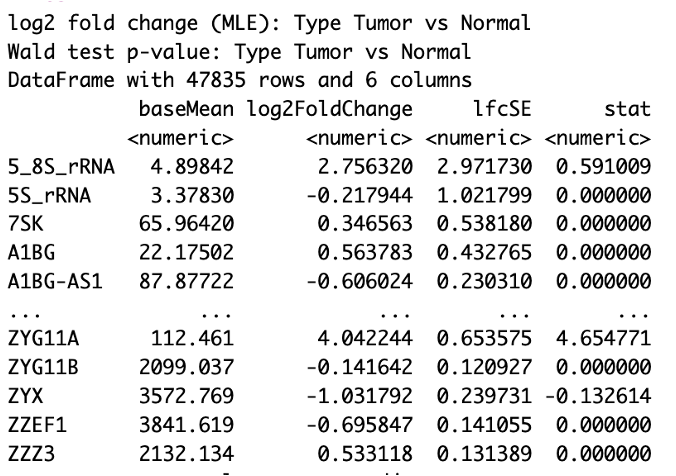
You will see that we include two parameters, alpha and lfcThreshold in our results() command. However, this does not filter the results we see in the table, but determines the thresholds for testing when determining the significant genes. Setting alpha to 0.05 is the cutoff set for significance in independent filtering. Setting lfcThreshold = 1 causes you to test against changes where lfcThreshold = 1, instead of the default value of 0.
summary(res)
out of 47835 with nonzero total read count
adjusted p-value < 0.05
LFC > 1.00 (up)    : 2095, 4.4%
LFC < -1.00 (down) : 1223, 2.6%
outliers [1]       : 1228, 2.6%
low counts [2]     : 9127, 19%
(mean count < 2)
We have over 3,000 genes of our original 48,000 or so that are said to be differentially expressed in our samples, with over 2,000 genes being upregulated and over 1,000 genes being downregulated.
Let’s take a look at some of the genes that are most upregulated and downregulated.
First, we subset to include genes whose adjusted p-value is 0.05 or less.
# subset results to include those adjusted p-value (FDR) less than 0.05
resSig <- subset(res, padj < 0.05)
To subset our downregulated genes, we sort resSig by log2FoldChange in order of increasing log2FoldChange, and then subset to those that are less than -1.00.
# downregulation
# genes that are found to be downregulated in our result
res_down_genes <- resSig[ order(resSig$log2FoldChange), ]
# genes whose log fold change is less than -1 (i.e. higher downregulation)
res_down_genes <- res_down_genes[ res_down_genes$log2FoldChange < -1.00, ]
res_down_genes <- data.frame(res_down_genes)
You can further save this table to a file if desired:
# save the table to a file
res_down_genes <- res_down_genes %>% mutate(gene_name = rownames(res_down_genes), .before = 1)
write_delim(res_down_genes, file = 'full_table_downreg_genes.csv', delim = ',')
If you look at the res_down_genes data frame, you should see something like the following, where the log2FoldChange orders the row output, beginning with the most downregulated gene.

We can do the same process to subset our upregulated genes, sorting resSig by log2FoldChange in order of decreasing log2FoldChange, and then subset to that are greater than 1.00.
# upregulation
# genes that are found to be upregulated in our result
res_up_genes <- resSig[ order(resSig$log2FoldChange, decreasing = TRUE), ]
# genes whose log fold change is greater than 1 (i.e. higher upregulation)
res_up_genes <- res_up_genes[ res_up_genes$log2FoldChange  > 1.00, ]
res_up_genes <- data.frame(res_up_genes)
You can further save this table to a file if desired:
# save the table to a file
res_up_genes <- res_up_genes %>% mutate(gene_name = rownames(res_up_genes), .before = 1)
write_delim(res_up_genes, file = 'full_table_upreg_genes.csv', delim = ',')
Plots to visualize DE results
Volcano Plot
Volcano plots are a very useful plot for visualizing the results of the differential expression analysis. These plots illustrate the fold change against the p-value. Let’s generate a volcano plot for our DE results.
We will use the EnhancedVolcano Bioconductor package for this plot. Use the following to install the Enhanced Volcano plot package:
 if (!requireNamespace('BiocManager', quietly = TRUE))
    install.packages('BiocManager')

  BiocManager::install('EnhancedVolcano')

library(EnhancedVolcano)
We will use the lfcShrink function for this visualization. Using this function shrinks the log2 fold changes for visualization purposes.
You will also see that we set up a contrast in the lfcShrink function. Using contrast specifies what comparison to extract from the object to build the results table. In our case we are still looking at tumor vs. normal in the Type variable, but this would be beneficial if, for example, we had a variable of interest with more than two levels are we wanted to compare specific levels only.
res_shrink <- lfcShrink(dds,
                 contrast = c('Type','Tumor','Normal'), res=res, type = 'normal')
Run the EnhancedVolcano function to generate the plot.
EnhancedVolcano(res_shrink,
                lab = rownames(res_shrink),
                x = 'log2FoldChange',
                y = 'pvalue')
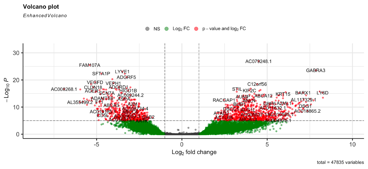
Here the gray dots are nonsignificant genes, green dots are those significant based on the log2 fold change threshold, and red are genes that are significant based on p-value and log2 fold change. Genes to the right of the plot are those that are upregulated, while those to the left are downregulated.
Note: This plot looks only at the p-value, not the adjusted p-value (FDR). However, our testing was based on the FDR of 0.05, so the results shown here are based on that threshold.
plotCounts
DESeq2 provides an easy-to-use plotCounts() function to plot the normalized counts for a single gene.
For example, let’s generate a plot that includes a gene with a high level of counts and a significant adjusted p-value, A2M:
# gene with higher counts for tumor-normal comparison
plotCounts(dds, gene='A2M', intgroup="Type")
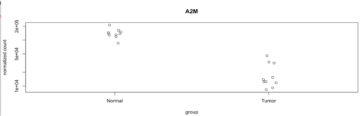
Here we can see the significant difference between the normalized counts in the normal samples vs. the tumor samples. A2M is downregulated in the tumor samples.
Boxplot
In addition to plotCounts(), we can create boxplots of the top several significant genes based on adjusted p-values.
The code below formats our data to be in order by p-value, pulls the top 9 genes, and then takes the log2 transformed normalized counts to generate the boxplots.
res_tidy <- results(dds, tidy=TRUE, contrast=c("Type", "Tumor", "Normal")) %>%
  arrange(padj, pvalue) %>%
  tibble()
res_tidy

goi <- res_tidy$row[1:9]
stopifnot(all(goi %in% names(dds)))
goi

tcounts <- t(log2((counts(dds[goi, ], normalized=TRUE, replaced=FALSE)+.5))) %>%
  merge(colData(dds), ., by="row.names") %>%
  gather(gene, expression, (ncol(.)-length(goi)+1):ncol(.))

tcounts %>%
  select(Row.names, Type, stage, gene, expression) %>%
  head %>%
  knitr::kable()

ggplot(tcounts, aes(Type, expression, fill=Type)) +
  geom_boxplot() +
  facet_wrap(~gene, scales="free_y") +
  labs(x="Type",
       y="Expression (log normalized counts)",
       fill="Type",
       title="Most significant differentially expressed genes based on p-values")
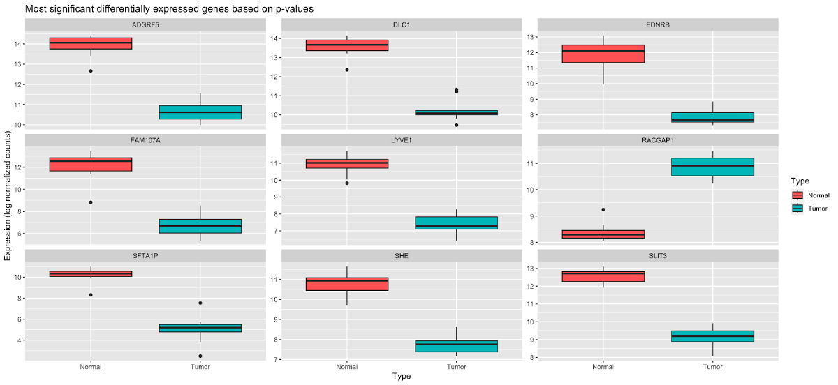
Here we can see that several genes here, ADGRF5, DLC1, EDNRB, FAM107A, LYVE1, SFTA1P, SHE, and SLIT3 are downregulated in tumor samples, while RACGAP1 is upregulated.
Now we will move on to clustering and visualization of our gene expression.
Clustering and visualization of gene expression
Next we will cluster our samples using the differentially expressed gene from DESeq output. Open the R script scripts/Practical_session_11_clustering_heatmap.R in the practical materials folder.
First we will prepare the data matrix using the normalized read counts of differentially expressed genes.
normalized_counts_2 <- normalized_counts %>% select(-1)
lognorm <- log2(normalized_counts_2+1)
resSig <- subset(res, padj < 0.05 & abs(log2FoldChange)>1)
resSig <- resSig[ order(abs(resSig$log2FoldChange),decreasing=TRUE), ]
outfile <- lognorm[rownames(resSig),]
outfile <- data.frame(outfile)%>%mutate(gene_name=rownames(outfile),.before=1)
outfilestr <-  paste("Practical_session_11","\\HC\\Practical_11_DESeq2_log_normalized_counts_up+down_genes.csv",sep="")
write_delim(outfile,file=outfilestr,delim=",")
We will use two ways to perform clustering and visualization.
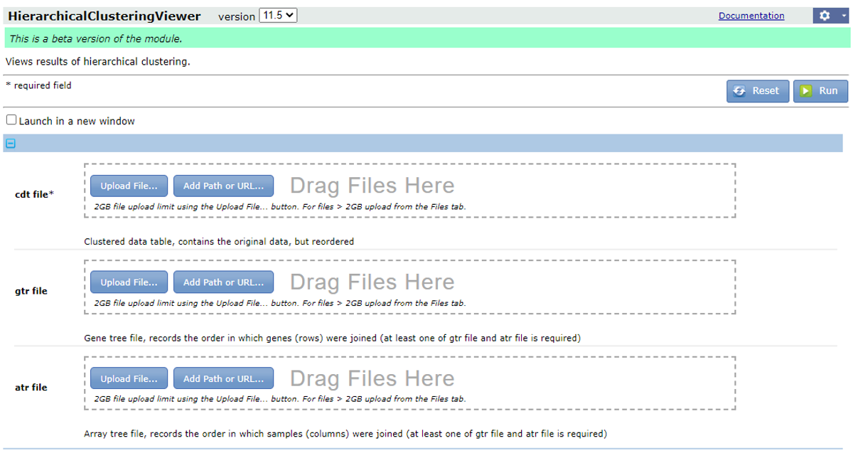
Hierarchical clustering using the GenePattern module
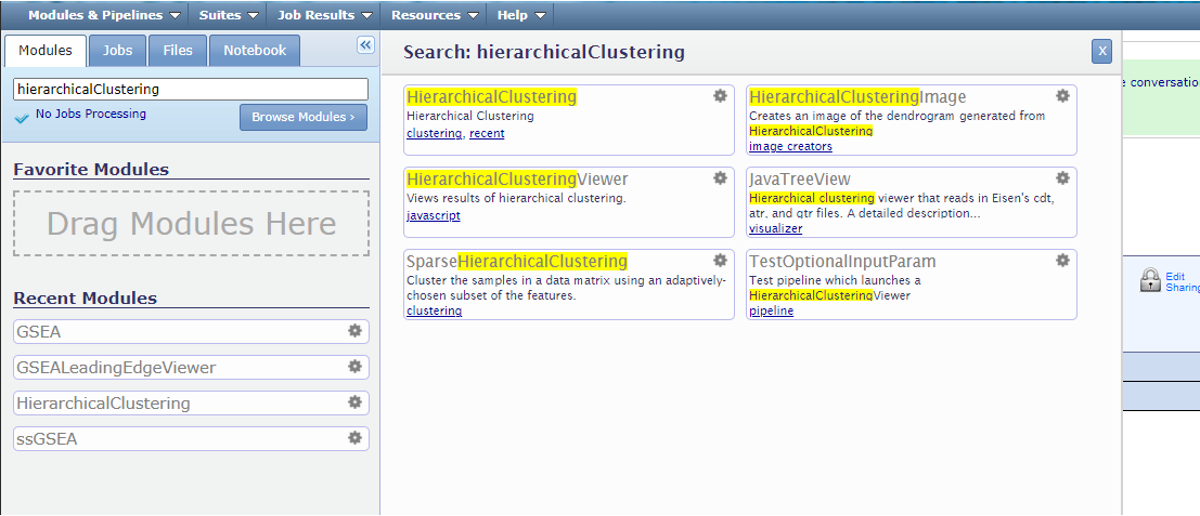
1. Login to GenePattern
First, we go to the website https://www.genepattern.org/. On the top toolbar, look for the ‘Run -> Public Server’ and hit.

Then register or login GenePattern following the instruction.
In the search bar, search for ‘HierarchicalClustering’ and click the module.
2. Prepare input files
The detailed format of .gct files could be found here.
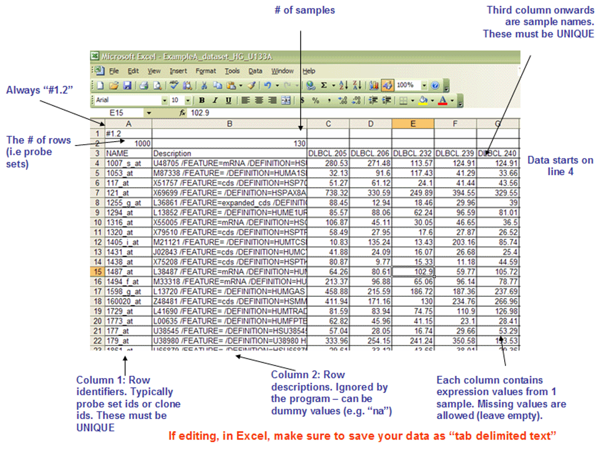
The file should be save in the format ‘text (Tab delimited)(*.txt’). In the file name, use double quotation marks so the file extension can be changed from .txt to .gct. We have generated this file in our folder /HC/Practical_11_DESeq2_log_normalized_counts_up+down_genes.gct

3. Run HierarchicalClustering
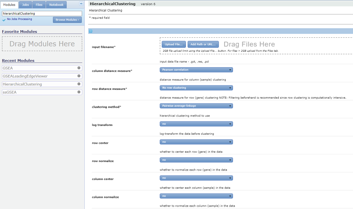
We set the following parameters for HierarchicalClustering.
input filenames: Drag the .cdt file to the ‘input filenames’.column distance measure: Uncentered correlation.row distance measure: Pearson correlation.clustering method: Pairwise centroid-linkage.row center: Subtract the median of each row.row normalize: nocolumn center: nocolumn normalize: no
Enter the ‘output base name’ and hit ‘Run’.
4. Visualize the results.
Find ‘Job’ tab on the tools bar. If the job is completed, you should see a check mark. Hit the job ID and we can check ‘Job Status’ and ‘Download Job’.

The results will be downloaded as a zipped file. Now extract the folder, you will find three files with the extension .atr, .cdt and .gtr, respectively.
Now go back to GenePattern and search for the module HierarchicalClusteringViewer. Drag the three files to the corresponding fields and hit ‘Run’.
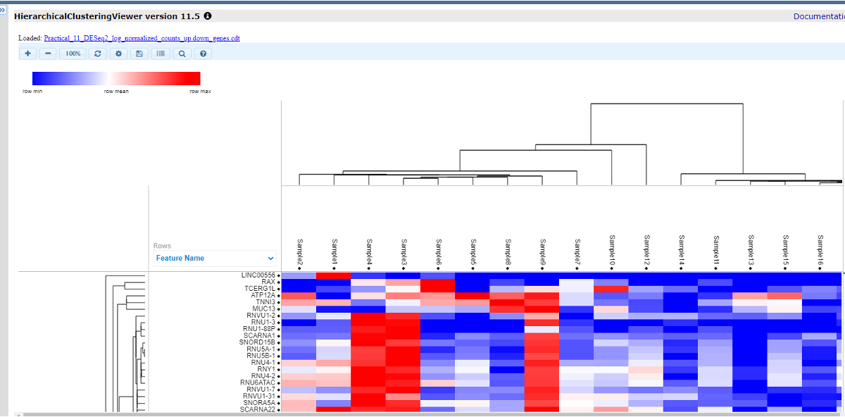
There is a toolbar on the top, where you can adjust the size, color, contrast, add labels and save the file. Now we will add labels by selecting this icon
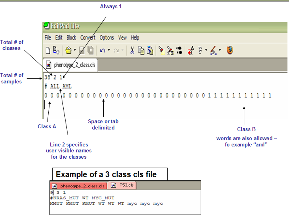
. The file for labels is in the .cls format.The detailed format of .gct files could be found here. It could be either of the following formats. We can edit the file in a notepad and save the file with extension .cls. Or you can use the file /HC/Practical_11_class.cls.
Now you should see a color bar below the sample names to indicate classes. You can select the ‘Add/Edit Labels’ ison again to change the colors for each group.

Heatmap in R
To produce a heatmap we will use the R package tidyHeatmap which provides user-friendly commands for heatmap generation. Return to the Practical_session_11_clustering_heatmap.R script.
First we will isolate a shortened list of the top 1000 differentially expressed genes by log fold change which we will include in the heatmap:
# get de genes
de_genes<-
  bind_rows(res_down_genes,res_up_genes)%>%
  arrange(-abs(log2FoldChange))%>%
  .[1:1000,]%>%
  pull(gene_name)
Finally we will reformat the expression matrix via pivoting, add some annotations with join, and save to variable heatmap_in, then finally draw a heatmap with the tidyHeatmap package.
# produce heatmap
library(tidyHeatmap)

heatmap_in<-normalized_counts%>%
  filter(gene_name %in% de_genes)%>%
  pivot_longer(-1,names_to = "Sample",values_to = "Exp")%>%
  left_join(metadata,by=c("Sample"="UID"))%>%
  group_by(gene_name)%>%
  mutate(Exp=(Exp-mean(Exp))/sd(Exp))%>%
  ungroup()
# expression is transformed to z-score for better comparison between genes

#examine the new table structure
heatmap_in

#draw heatmap
tidyHeatmap::heatmap(.data = heatmap_in,
                     .row = gene_name,
                     .column=Sample,
                     .value = Exp,
                     clustering_method_columns="ward.D2",
                     clustering_method_rows="ward.D2",
                     show_row_names=FALSE)%>%
  add_tile(Type)%>%
  add_tile(stage,palette = c('#1b9e77','#d95f02','#7570b3'))

Gene set and pathway enrichment analysis
For gene set and pathway enrichment analysis, we will show two approaches, GSEA and GSVA
Pathway analysis with GSEA
GSEA is a user-friendly GUI tool for pathway analysis. Go to this link for the GSEA user guide. There are two ways to run GSEA.
1. Download GSEA/login to GSEA module.
On the GSEA website, you can download the standalone GSEA package and run the application on the local laptop. It requires JAVA installation.

Alternatively, you can run it as a module of the web server GenePattern. We will use this approach for this practical session. Now we logged into GenePattern. In the search bar, search for ‘GSEA’ and enter the module.

Now we can select parameters for GSEA.
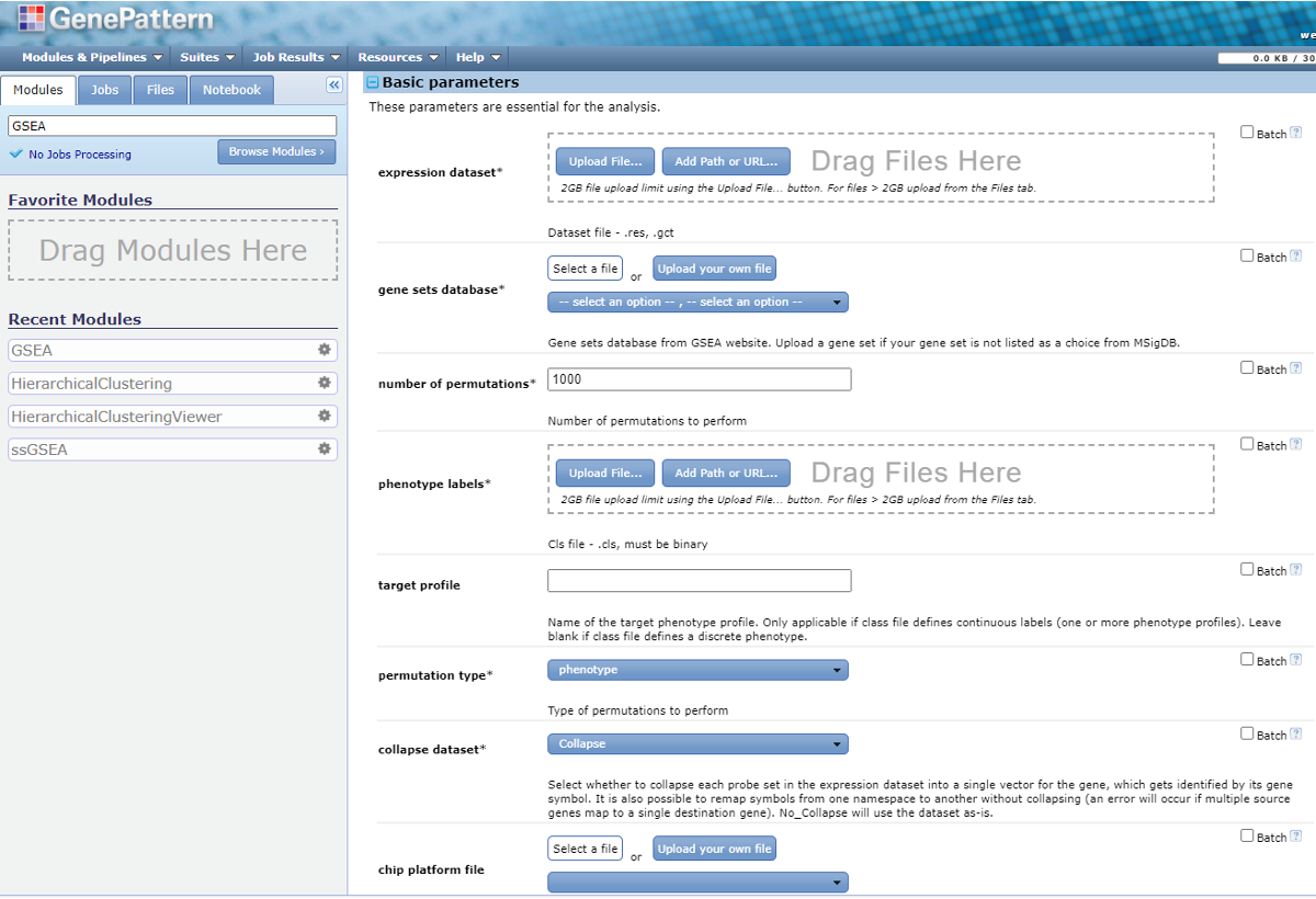
2. Prepare input files for GSEA.
GSEA requires two input data files, expression dataset and phenotype label. And there are two optional input data files: gene sets and chip annotation.
2.1 Expression dataset
Expression dataset contains features (genes/probes), samples and an expression data value for each feature in each sample. Normalization should be applied prior to running GSEA.
Normalization method should transform the data to be comparable to one another across features (aka, genes) within a sample and comparable to one another across samples. Some common quantifications generated by RNA-seq pipeline are NOT properly normalized for comparisons across samples, including
- Counts/Expected Counts
- Transcripts per Million (TPM)
- FPKM/RPKM
Appropriate normalization methods include:
- Trimmed Mean of M-values (TMM) generated by edgeR
- Median ratio/Geometric normalization generated by DESeq/DESeq2
We use the normalized read counts generated by DESeq to prepare the expression dataset for GSEA. We are going to prepare a .gct file from the .csv file using Excel in the same way as the last section. The detailed format of .gct files could be found here.
We have generated this file in the class folder /GSEA/Practical_11_DESeq2_normalized_counts.gct
2.2 phenotype label
Phenotype labels are files of .cls format. We will use the same .cls as we did in the hierarchical clustering viewer for the sample labels (/HC/Practical_11_class.cls).
3. Run GSEA.
Next we dragged the .gct and .cls files to the expression dataset and phenotype labels, respectively. Then we enter the following basic parameters.
- gene sets database: Under the dropdown list you will find data sets from MSigDB. Here is the introduction about the gene sets pools in MSigDB. The Curated Gene Sets (C2) is the commonly used pool. But we do not recommend running GSEA against the complete C2 set. You can specify multiple subsets of C2 (e.g. c2.cp.kegg) instead. You can also submit your own gene set file in gmx or gmt format.
- The ‘batch’ option on the right corner will allow you to submit a batch of jobs. For this parameter, it will submit one job for each gene set database you select.
- For this class, we select the ‘batch’ option and two gene sets: ‘h.all.v2023.1.Hs.symbols.gmt’ and ‘c2.cp.kegg.v2023.1.Hs.symbols.gmt’.
- permutation type: The type of permutation to perform in assessing the statistical significance of the enrichment score. The default option is phenotype. When you have too few samples to do phenotype permutations (that is, when you have fewer than seven (7) samples in any phenotype), change the permutation type to ‘Gene_set’.
- collapse dataset: If the unique identifier is probe set and needs to be collapsed into genes, select ‘Collapse’. Otherwise switch to ‘No_collapse’.
- In the ‘Advanced parameters’ -> Algorithmic, you can change the max/min gene set size.
Now we finalized all the parameters, hit ‘Run’ on the bottom of the page.
4. GSEA results.
Find ‘Job’ tab on the tools bar. If the job is completed, you should see a check mark. Hit the job ID and we can check ‘Job Status’.

The output files will be downloaded as a .zip package. Next we extract all the files and open the file index.html. It is a summary of the analysis.
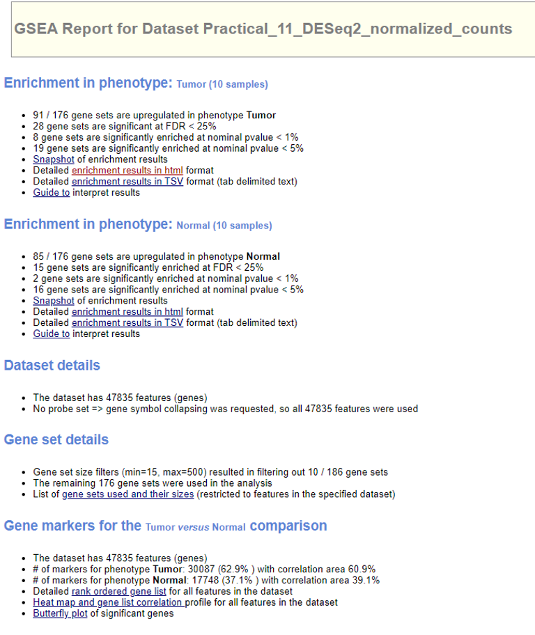
Select ‘Detailed enrichment results in html format’ to view the enrichment scores and p-values for each gene set. GSEA computes four key statistics for the gene set enrichment analysis report:
- Enrichment Score (ES): reflects the degree to which a gene set is overrepresented at the top or bottom of a ranked list of genes. A positive ES indicates gene set enrichment at the top of the ranked list; a negative ES indicates gene set enrichment at the bottom of the ranked list.
- Normalized Enrichment Score (NES): GSEA accounts for differences in gene set size and in correlations between gene sets and the expression dataset; therefore, the normalized enrichment scores (NES) can be used to compare analysis results across gene sets.

- False Discovery Rate (FDR): The estimated probability that a gene set with a given NES represents a false positive finding.
- Nominal P Value
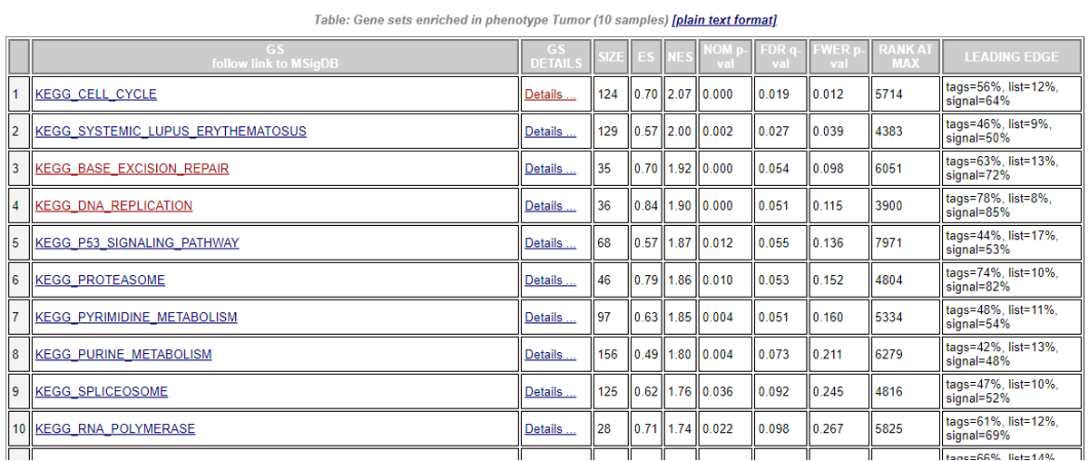
In the ‘GS Details’ column, select ‘Details’ for the gene set of interest, you will view the GSEA result for that gene set.
Enrichment plot: a graphical view of the enrichment score for a gene set
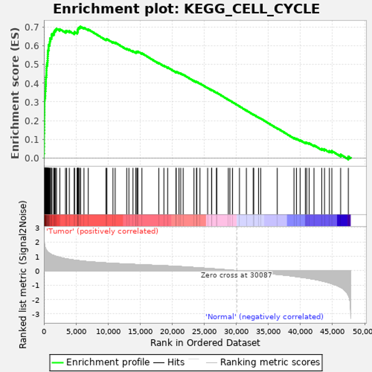
- The top portion of the plot shows the running ES for the gene set as the analysis walks down the ranked list. The score at the peak of the plot (the score furthest from 0.0) is the ES for the gene set. Gene sets with a distinct peak at the beginning (such as the one shown here) or end of the ranked list are generally the most interesting.
- The middle portion of the plot shows where the members of the gene set appear in the ranked list of genes.
The leading edge subset of a gene set is the subset of members that contribute most to the ES. For a positive ES (such as the one shown here), the leading edge subset is the set of members that appear in the ranked list prior to the peak score. For a negative ES, it is the set of members that appear subsequent to the peak score. - The bottom portion of the plot shows the value of the ranking metric as you move down the list of ranked genes. The ranking metric measures a gene’s correlation with a phenotype. The value of the ranking metric goes from positive to negative as you move down the ranked list. A positive value indicates correlation with the first phenotype and a negative value indicates correlation with the second phenotype. For continuous phenotypes (time series or gene of interest), a positive value indicates correlation with the phenotype profile and a negative value indicates no correlation or inverse correlation with the profile.
Now we go back to the main menu of the report, and look for ‘Gene Markers’ and click the ‘Butterfly plot’..

Butterfly plot showing the positive and negative correlation between gene rank and the ranking metric score. By default, the butterfly plot shows the top 100 genes.The butterfly plot shows the observed correlation, as well as permuted (1%, 5%, 50%) positive and negative correlation, for the top genes.

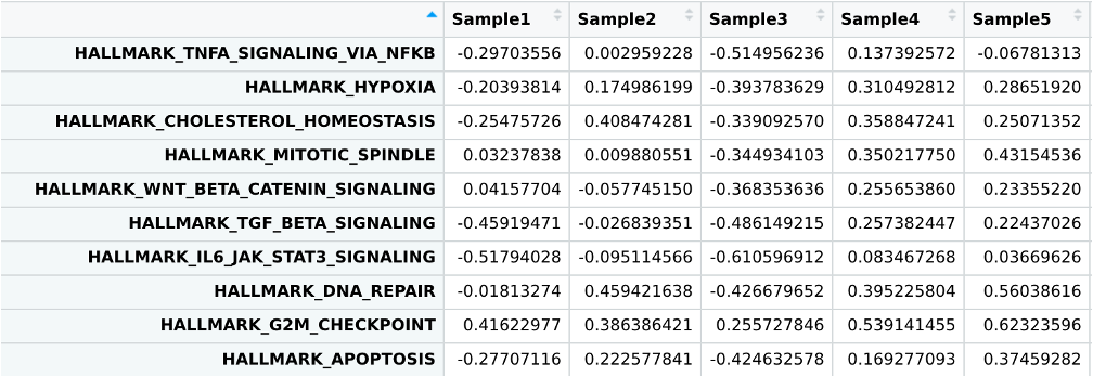
GSVA with R
Here we will demonstrate how to use GSVA in R.
Like GSEA, GSVA is an algorithm for gene set enrichment analysis. The main benefit of GSVA is that unlike GSEA which is supervised and requires sample labels, GSVA allows you to generate per-sample pathway enrichment scores which can be used further with standard statistical analyses of your choice (e.g. t-test, correlation, etc). Open the third script in the scripts/ folder, Practical_session_11_GSVA.R.
We will begin by downloading some genesets with the msigdb package in R, and then run GSVA with our RNAseq expression matrix.
# install and load required packages
if (!requireNamespace("BiocManager", quietly = TRUE))
  install.packages("BiocManager")
if (!requireNamespace("msigdb", quietly = TRUE))
  BiocManager::install("msigdb")
if (!requireNamespace("GSEABase", quietly = TRUE))
  BiocManager::install("GSEABase")

library(msigdb)
library(GSEABase)

# get genesets: org=organism, id=gene id format
msigdb.hs = getMsigdb(org = 'hs', id = 'SYM')

# extract hallmark genesets
hallmarks = subsetCollection(msigdb.hs, 'h')

# install GSVA if necessary, then load
if (!requireNamespace("GSVA", quietly = TRUE))
  BiocManager::install("GSVA")
library(GSVA)

# run gsva
gsva_out<-GSVA::gsva(as.matrix(normalized_counts[,-1]),geneIds(hallmarks))
This will produce per-sample enrichment scores for every geneset in your geneset list, in this case the MSigDB hallmarks.
View(gsva_out)
You can now use these enrichment scores for statistical analyses much like you would any other quantitative measurement. For demonstration, we will use these scores to perform a simple t-test of Tumor vs Normal geneset enrichment.
# install broom package if necessary
if (!requireNamespace("broom", quietly = TRUE))
  install.packages("broom")

gsva_signif<-
# start by reformatting gsva output similar to how we did with the heatmap
  gsva_out%>%
  as.data.frame()%>%
  rownames_to_column("pathway")%>%
  pivot_longer(-1,names_to="UID",values_to="Enrich")%>%
  left_join(metadata)%>%
# ensure that enrichment values are w/ respect to tumor expression
  mutate(Type=factor(Type,levels=c("Tumor","Normal")))%>%
# perform t.test, use the `tidy function` to keep output in table format
  group_by(pathway)%>%
  summarise(t.test(Enrich~Type)%>%broom::tidy())%>%
  mutate(fdr=p.adjust(p.value,method="BH"))

# subset to the top 10 most significant pathway changes
gsva_signif%>%
  arrange(fdr)%>%
  .[1:10,]

As you can see, the results contain many similar pathways to GSEA: cell division checkpoints, unfolded protein response, and DNA repair. Conveniently if you wanted to find pathways enriched in later stage tumors you could simply reuse the same GSVA enrichment table and perform a similar t-test or ANOVA comparing tumors by stage.
Identification of gene fusion
We will use the package STAR-Fusion to identify gene fusion events. A detailed manual of STAR-Fusion can be found at the wiki page.
1. Let’s submit the job to run STAR-Fusion. It will take ~30 mins to run the job.
cd /data/$USER/practical_session_11/scripts

sbatch --mem=4g --cpus-per-task=2 --time 2:00:00 --job-name STARFu run_STAR-Fusion.sh
2. Now let’s review the bash file: vi run_STAR-Fusion.sh
INDIR=/data/classes/DCEG_Somatic_Workshop/Practical_session_11/Fusion/Practical_session_11/Fusion/

OUTDIR=/data/$USER/Practical_session_11/Fusion/SC623637_Inspect

fq1=$INDIR/SC623637_R1.fastq.gz
fq2=$INDIR/SC623637_R2.fastq.gz

if [[ ! -d $OUTDIR ]];then mkdir $OUTDIR;fi

module load STAR/2.7.8a
module load STAR-Fusion/1.10.0

genome_lib=/fdb/CTAT/__genome_libs_StarFv1.10/GRCh38_gencode_v37_CTAT_lib_Mar012021/ctat_genome_lib_build_dir

STAR-Fusion --genome_lib_dir $genome_lib -J $INDIR/Chimeric.out.junction --left_fq $fq1  --right_fq $fq2 --output_dir $OUTDIR --examine_coding_effect --FusionInspector inspect
To run STAR-Fusion, you will need to load both STAR and STAR-Fusion modules.
There are two ways to run STAR-Fusion. You can start from the FASTQ files and it will run the alignment automatically. Alternatively, in the context of a transcriptome analysis pipeline that already incorporates the alignment module with STAR, you can run STAR-Fusion with a ‘kickstart’ mode by using the STAR output ‘Chimeric.junction.out’ file.
To use the ‘kickstart’ mode, when you run STAR you should include the following parameters that are relevant to STAR-Fusion:
--chimSegmentMin 12 \  # ** essential to invoke chimeric read detection & reporting **
--chimJunctionOverhangMin 8 \
--chimOutJunctionFormat 1 \   # **essential** includes required metadata in Chimeric.junction.out file.
--alignSJDBoverhangMin 10 \
--alignMatesGapMax 100000 \   # avoid readthru fusions within 100k
--alignIntronMax 100000 \
--alignSJstitchMismatchNmax 5 -1 5 5 \   # settings improved certain chimera detections
--outSAMattrRGline ID:GRPundef \
--chimMultimapScoreRange 3 \
--chimScoreJunctionNonGTAG -4 \
--chimMultimapNmax 20 \
--chimNonchimScoreDropMin 10 \
--peOverlapNbasesMin 12 \
--peOverlapMMp 0.1 \
--alignInsertionFlush Right \
--alignSplicedMateMapLminOverLmate 0 \
--alignSplicedMateMapLmin 30
Here we demonstrated the running STAR-Fusion from the Chimeric.junction.out file.
--genome_libspecifies the genome reference. This reference is from the Trinity Cancer Transcriptome Analysis Toolkit (CTAT).-Jspecifies the chimeric junction file. It is essential to use the parameter--chimOutJunctionFormat 1when you run R so the format of the junction file is compatible with STAR-Fusion.--FusionInspector: There is a companion tool called FusionInspector that is integrated in the STAR-Fusion as submodule. It reconstructs the predicted fusions based on the identified fusion-supporting reads for validation. Fusion Inspector can be run in two modes: inspect and validate.--FusionInspector inspect: only the reads identified by STAR-Fusion as evidence supporting the fusion prediction are aligned directly to a target set of fusion-gene contigs for exploration using IGV.--FusionInspector validate: involves a more rigorous process of reevaluating the entire set of input reads, aligning the reads to a combination of the reference genome and a set of fusion-gene contigs based on the STAR-Fusion predictions.
If either mode of FusionInspector is invoked, you have to specify the fastq files using –left_fq and –right_fq. STAR-Fusion will create a FusionInspector/ output directory.
FusionInspector can also be run as a standalone application. For details about the Fusion Inspector, see this wiki page.--examine_coding_effectinvokes an analysis of the impact of the fusion event on coding regions. The coding effect results are appended as additional columns in the STAR-Fusion tab-delimited output file
3. You may now check the output of STAR-Fusion. We included the output files in the folder /Practical_session_11/Fusion_Output/
The main output file is a tab-delimited file named ‘star-fusion.fusion_predictions.tsv’, along with an abridged version that excludes the identification of the evidence fusion reads and called ‘star-fusion.fusion_predictions.abridged.tsv’. When we invoke –examine_coding_effect, there is another file ‘star-fusion.fusion_predictions.abridged.coding_effect.tsv’.
Now let’s check the file star-fusion.fusion_predictions.abridged.tsv.
#FusionName     JunctionReadCount       SpanningFragCount       est_J   est_S   SpliceType      LeftGene        LeftBreakpoint  RightGene       RightBreakpoint      LargeAnchorSupport      FFPM    LeftBreakDinuc  LeftBreakEntropy        RightBreakDinuc RightBreakEntropy       annots
NFIB--FOCAD     27      11      27.00   11.00   ONLY_REF_SPLICE NFIB^ENSG00000147862.17 chr9:14313482:- FOCAD^ENSG00000188352.12        chr9:20862578:+ YES_LDAS     0.3016  GT      1.9086  AG      1.7465  ["INTRACHROMOSOMAL[chr9:6.26Mb]"]
CD151--DEAF1    19      48      19.00   47.61   ONLY_REF_SPLICE CD151^ENSG00000177697.19        chr11:836442:+  DEAF1^ENSG00000177030.17        chr11:688460:-       YES_LDAS        0.5287  GT      1.8892  AG      1.8892  ["INTRACHROMOSOMAL[chr11:0.13Mb]"]
EML4--ALK       10      31      10.00   31.00   ONLY_REF_SPLICE EML4^ENSG00000143924.19 chr2:42295516:+ ALK^ENSG00000171094.18  chr2:29223528:- YES_LDAS    0.3255   GT      1.6895  AG      1.9086  ["ChimerKB","ChimerSeq","TCGA_StarF2019","CCLE_StarF2019","YOSHIHARA_TCGA","HaasMedCancer","Klijn_CellLines","chimerdb_pubmed","DEEPEST2019","GUO2018CR_TCGA","ChimerPub","TumorFusionsNAR2018","Cosmic","INTRACHROMOSOMAL[chr2:12.25Mb]"]
The JunctionReads column indicates the number of RNA-Seq fragments containing a read that aligns as a split read at the site of the putative fusion junction.
The SpanningFrags column indicates the number of RNA-Seq fragments that encompass the fusion junction such that one read of the pair aligns to a different gene than the other paired-end read of that fragment.
The ‘LargeAnchorSupport’ column indicates whether there are split reads that provide ‘long’ (set to length of 25 bases) alignments on both sides of the putative breakpoint. Those fusions supported only by split reads (no spanning fragments) and lack LargeAnchorSupport are often highly suspicious and tend to be false positives.
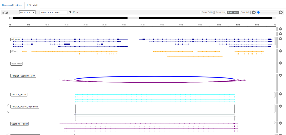
4. Next we can check the output of Fusion-Inspector in the folder /Practical_session_11/Fusion_Output/FusionInspector-inspect/. If you have mapped your biowulf account as a drive in your local laptop, alternatively, you can download these results from GitHub. Find this folder and open the file finspector.fusion_inspector_web.html in the web browser.
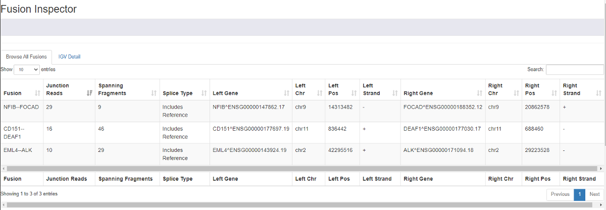
You can view the evidence for fusions. There is a summary of all the detected fusions and statistics. And if you select one fusion event, you will be directed to the IGV view of the detailed alignment.