Presenter: John McElderry
Introduction
ggplot2 is the most popular graphing framework in R, and in fact it’s the most downloaded package for R period, graphing or otherwise. This is for good reason since ggplot2 is very flexible, powerful, and relatively intuitive compared to other graphing frameworks in R. There are also many users actively developing new plugins for added functionality and accessibility. For the same reasons it can also be tough to get started and get the most out of ggplot2 without some guidance.
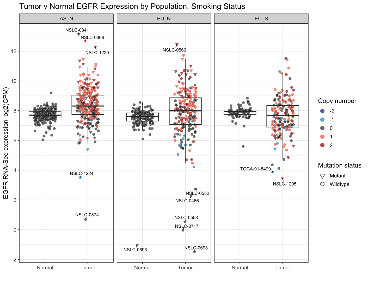
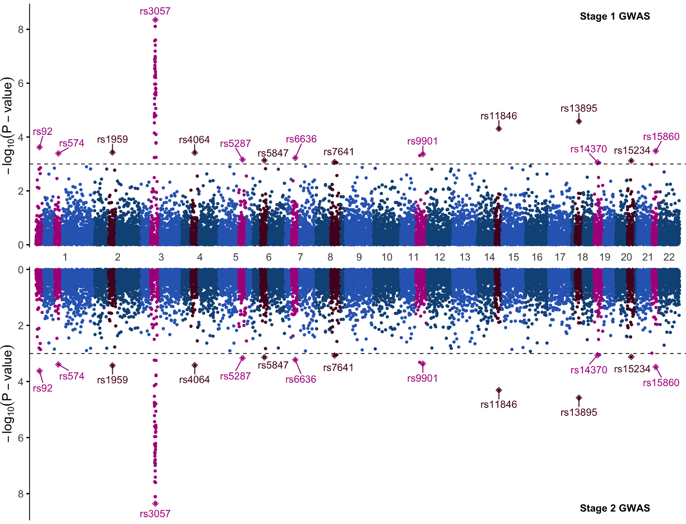
In this practical we will focus on how to use the ggplot2 R package to create advanced and appealing visualizations from genomics data. We will primarily focus on two plots today: 1) a simple boxplot to visualize EGFR expression in tumor and normal tissue samples, and 2) a classic Manhattan plot for GWAS data:
First, download and unzip the R files for today’s session here. Then, open RStudio and the downloaded script Practical_Session12.R.
We will need to use functions from several different packages in addition to ggplot2 throughout this session:
- ggsci
- ggrepel
- scales
- cowplot
- tidyverse
- valr
- qqman
To do this, run the first code chunk within the Practical_Session12.R script to install any missing packages:
dependencies<-c("ggsci","ggrepel","scales","cowplot","tidyverse","valr","qqman")
packages_needed<-c()
for(package in dependencies)
{
  if(!requireNamespace(package,quietly = T)){
    packages_needed<-c(packages_needed,package)
  }
}
install.packages(packages_needed)
Boxplot
In analysis of multi-omics data, it is common practice to assess the impact of mutations and copy number alterations on gene expression across different datasets. In our Sherlock-Lung study, we aim to investigate how EGFR mutations or copy number alterations from WGS data affect the expression of the EGFR gene in RNA-Seq data across three major groups of lung cancers (Asian never-smokers, European never-smokers, and European smokers). We also seek to identify samples with altered gene expression status that lack mutations or copy number alterations.
To achieve this, we will generate a box plot with additional annotations, which is a widely used and effective visualization tool.
Load Data
To begin, first load the necessary data which we downloaded with the zip folder earlier. We need to load this data into R using the read_rds() function like so, pasting the path to the downloaded file between the quotation marks:
egfr_exp <- read_rds(‘’)
The default download path will differ slightly depending on your machine:
Mac:
- ‘~/Downloads/Practical_12/egfr_exp.RDS’
Windows:
- ‘C:\Users[your username]\Downloads\Practical_12\egfr_exp.RDS’
Once you have loaded this data into R, the data will be saved to a variable ‘egfr_exp’. Take a look at the data table by entering the table name in the console:
egfr_exp
# A tibble: 1,208 × 8
   Subject   Group Tumor_Barcode Gene  Data_Type   Exp Mutation_Status   CNV
   <chr>     <chr> <chr>         <chr> <chr>     <dbl> <chr>           <dbl>
 1 NSLC-0264 AS_N  NSLC-0264-T01 EGFR  Normal     7.38 Wildtype            0
 2 NSLC-0274 AS_N  NSLC-0274-T01 EGFR  Normal     7.75 Wildtype            0
 3 NSLC-0264 AS_N  NSLC-0264-T01 EGFR  Tumor     10.4  Mutant              1
 4 NSLC-0269 AS_N  NSLC-0269-T01 EGFR  Tumor      8.58 Mutant              1
 5 NSLC-0274 AS_N  NSLC-0274-T01 EGFR  Tumor      9.15 Wildtype            0
 6 NSLC-0278 AS_N  NSLC-0278-T01 EGFR  Tumor      8.35 Mutant              1
 7 NSLC-0262 AS_N  NSLC-0262-T01 EGFR  Normal     6.36 Wildtype            0
 8 NSLC-0265 AS_N  NSLC-0265-T01 EGFR  Normal     7.51 Wildtype            0
 9 NSLC-0284 AS_N  NSLC-0284-T01 EGFR  Normal     8.28 Wildtype            0
10 NSLC-0262 AS_N  NSLC-0262-T01 EGFR  Tumor      9.01 Mutant              1
# 1,198 more rows
This is an RNAseq expression table with some genomic feature annotations. You can see we have a series of sample annotations like Subject, [Population] Group, Data_Type, and Tumor_Barcode, some RNA columns like Gene and log2 CPM expression (Exp), and then some genomic annotations like EGFR mutation status and copy number (CNV, -2 to +2).
Let’s turn this data into a boxplot of expression values.
First, let’s create a graph (for those new to the course, the %>% symbol is called a pipe, and it transfers data from the left of the pipe to commands on the right of the pipe):
Mapping and Geoms
egfr_exp %>% ggplot(mapping=aes(x=Data_Type,y=Exp))
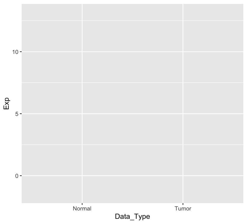
The ggplot command creates the skeleton of a graph. Within it, the argument mapping=aes() is how we define the structure of the graph, such as the axes, whether data should be colored according to certain groups, labeled according to a data column, etc. All we’ve done so far is define the axes:
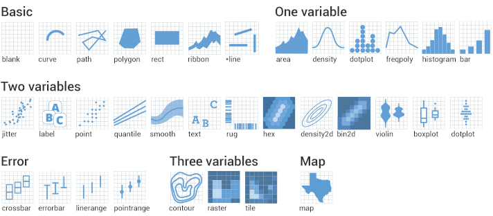
To visualize data we need to add geoms, which encompass all of the shapes used to visualize data such as points, boxes, violins, density functions, etc.
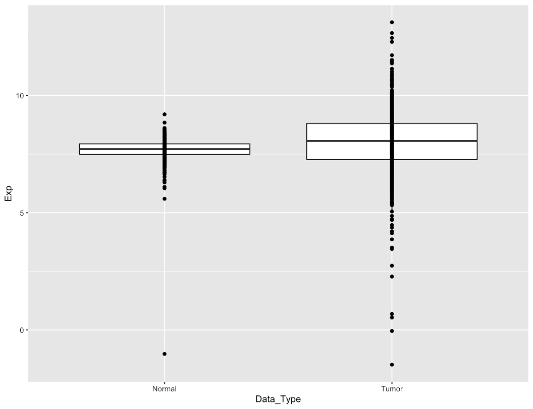
We will add two geoms: boxplots, and individual points for each sample:
egfr_exp %>%
  ggplot(aes(x=Data_Type,y=Exp)) +
  geom_boxplot(outlier.shape = NA) +
  geom_point()
By adding + to the end of a line, ggplot2 will stitch multiple commands together into one single plot. Here’s the result:
Now we have our data plotted. A couple of points to note:
- ordering of the geoms matters. The points are rendered on top of the box because we drew the boxes first. If we reverse the order, some of the points will be obscured underneath the box.
- we set
outlier.shape=NAin the boxplot to avoid rendering boxplot outliers. This is because they’re redundant with our data points.
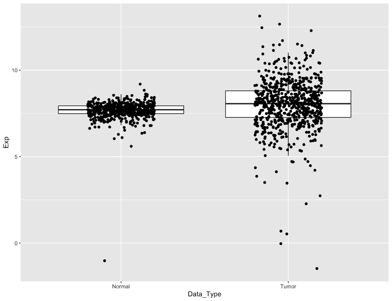
Currently our data points are hard to see because they’re all drawn in one vertical line. It’s impossible to tell how many points are in the center of the boxes because the data is too dense. We can fix this by spreading the points out horizontally by adding jittering to our geom_point function:
Jittering points
# jitter the points to improve visibility
egfr_exp %>%
  ggplot(aes(x=Data_Type,y=Exp))+
  geom_boxplot(outlier.shape = NA)+
  geom_point(position = position_jitter(width=0.25,height = 0.01,seed = 100))
Jittering adds random noise to the points to spread them out, as controlled by the width and height parameters. Because the points are spread randomly, setting a seed will ensure that we always get the same graph.
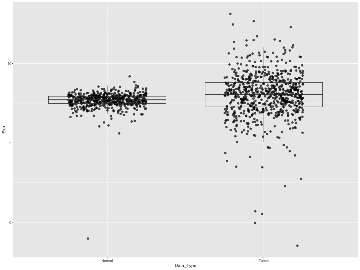
Now we can see the bulk of our points, however now the points are obscuring the boxes. We can improve this a bit by bringing the boxes to the top layer of the plot, making them transparent, and then adding some transparency to the points.
# reorder points under boxplot, make boxplot transparent, minor changes to points
egfr_exp %>%
  ggplot(aes(x=Data_Type,y=Exp))+
  geom_point(stroke=0.2,
             size=2.5,
             alpha=0.7,
             position = position_jitter(width=0.25,height = 0.01,seed = 100))+
  geom_boxplot(outlier.shape = NA,fill=NA)
- setting the
fillwithin the geom_boxplot is how we turn the boxes transparent; by setting the fill to NA this removes any color - setting the
alphawithin geom_point is how we can turn the points slightly transparent. We set it to 0.7; you could decrease this number to make them more transparent, or increase it to 1 to make them totally opaque like before.
It’s still a bit tough to see the box lines, particularly for the normal sample. We’ve also increased the point size a bit which will make individual points easier to see, but as a consequence the boxes are still crowded despite adding jittering.
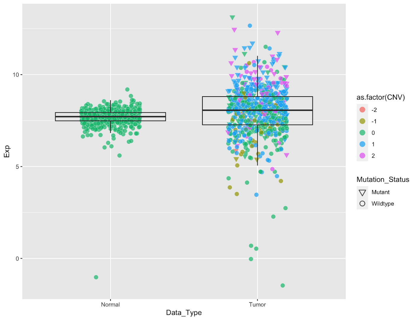
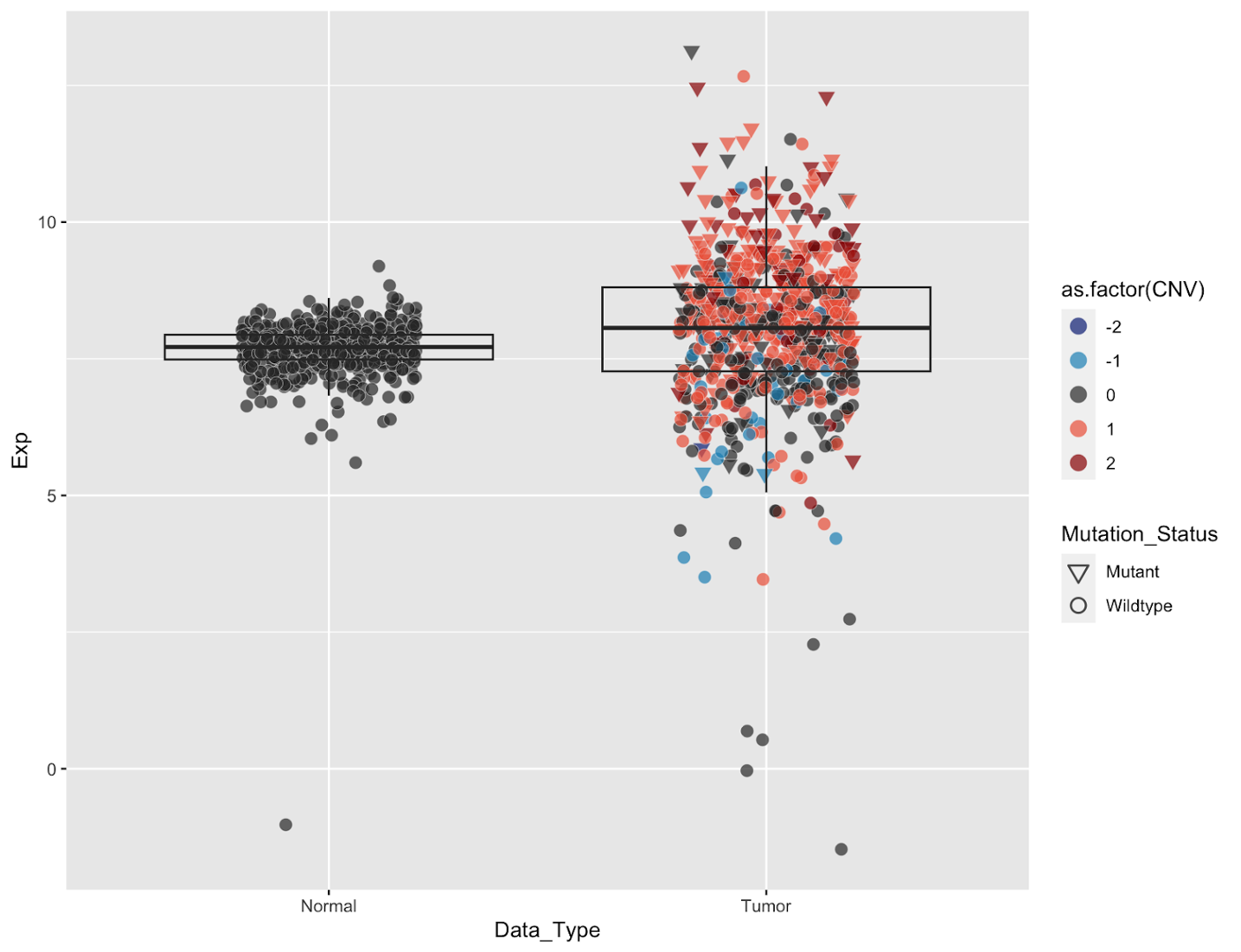
We can fix both of these problems by changing the color of the points to make the box stand out more and distinguish points by color. We will do so by coloring the points according to their EGFR copy number status. We can simultaneously visualize mutation status by changing the point shapes. We will do this within the mapping setting of the geom_point command. _(NOTE: it’s important to do this within geom_point() because we want these settings to apply to only the points; if done within the ggplot() command it will apply to every geom in the figure</em>)
Add Color and Change Point Shapes
# add color and shape, fix legends
egfr_exp %>%
  ggplot(aes(x=Data_Type,y=Exp))+
  geom_point(aes(fill=as.factor(CNV),shape=Mutation_Status),
             col='gray95',
             stroke=0.2,
             size=2.5,
             alpha=0.7,
             position = position_jitter(width=0.25,height = 0.01,seed = 100))+
  geom_boxplot(outlier.shape = NA,fill=NA)+
  #
  scale_shape_manual(values = c(25,21))+
  guides(fill=guide_legend(override.aes=list(shape=21,size=4)),
         shape=guide_legend(override.aes=list(stroke=0.8,size=3,col='black')))
It’s now much easier to see what’s happening within our boxplot, and we get additional knowledge about genomic features. A few things to note:
scale_shape_manual(values = c(25,21))sets the shape types for our graph, where 25=hollow inverted triangle (Mutant), 21=hollow circle (Wildtype). If you try running this code without this line you’ll see that the points are still black. This is because the default shapes are solids that cannot be filled. For all the shape codes, see here.- Similarly the colors legend needs to be manually updated to a new shape. That’s accomplished with the
guides(fill=guide_legend(override.aes=list(shape=21,size=4)))command, which changes the legend shape to a hollow circle. - We also changed the shape legend to be solid black. Within this last command we changed the color of the shape outlines to a very light gray by specifying
col="gray95"withingeom_pointwhich looks nice within the plot but is hard to read in the legend.
Now we have some colors, but they aren’t particularly great colors. The colors for 0 and 1 are tough to distinguish for example, and the color scheme uses both red and green which is bad for colorblind readers. Let’s override these colors:
# change colors
egfr_exp %>%
  ggplot(aes(x=Data_Type,y=Exp))+
  geom_point(aes(fill=as.factor(CNV),shape=Mutation_Status),
             col='gray95',stroke=0.2,size=2.5,alpha=0.7,
             position = position_jitter(width=0.25,height = 0.01,seed = 100))+
  geom_boxplot(outlier.shape = NA,fill=NA)+
  scale_shape_manual(values = c(25,21))+
  guides(fill=guide_legend(override.aes=list(shape=21,size=4)),
         shape=guide_legend(override.aes=list(stroke=0.8,size=3,col='black')))+
  #
  scale_fill_manual(values = c('#0c2c84','#1d91c0','gray20','#ef6548','#990000'))
These colors are much easier to read (NOTE: when visualizing CNV data it’s standard for red to signify amplification and blue to signify deletion). We’ve set these colors manually with the command scale_fill_manual(values = c('#0c2c84','#1d91c0','gray20','#ef6548','#990000')) using hex color codes, but you could also use a predefined color palette such as from the ggsci library, or with the scale_fill_brewer() command in ggplot2.
(Here is a resource to generate your own hex color codes in the future https://htmlcolorcodes.com/ )
Faceting, Axis/Plot/Legend Titles, Themes
We’re going to be adding a few relatively simple features at once.
# add more features
egfr_exp %>%
  ggplot(aes(x=Data_Type,y=Exp))+
  geom_point(aes(fill=as.factor(CNV),shape=Mutation_Status),
             col='gray95',stroke=0.2,size=2.5,alpha=0.7,
             position = position_jitter(width=0.25,height = 0.01,seed = 100))+
  geom_boxplot(outlier.shape = NA,fill=NA)+
  scale_shape_manual(values = c(25,21))+
  guides(fill=guide_legend(override.aes=list(shape=21,size=4)),
         shape=guide_legend(override.aes=list(stroke=0.8,size=3,col='black')))+
  scale_fill_manual(values = c('#0c2c84','#1d91c0','gray20','#ef6548','#990000'))+
  #
  # panel by population
  facet_wrap(~Group)+
  # axis and legend labels
  labs(x='',y='EGFR RNA-Seq expression log2(CPM)',fill='Copy number',
       shape='Mutation status', title='Tumor v Normal EGFR Expression by Population, Smoking Status')+
  # add more y axis breaks
  scale_y_continuous(breaks = scales::pretty_breaks(n = 6))+
  # change legend
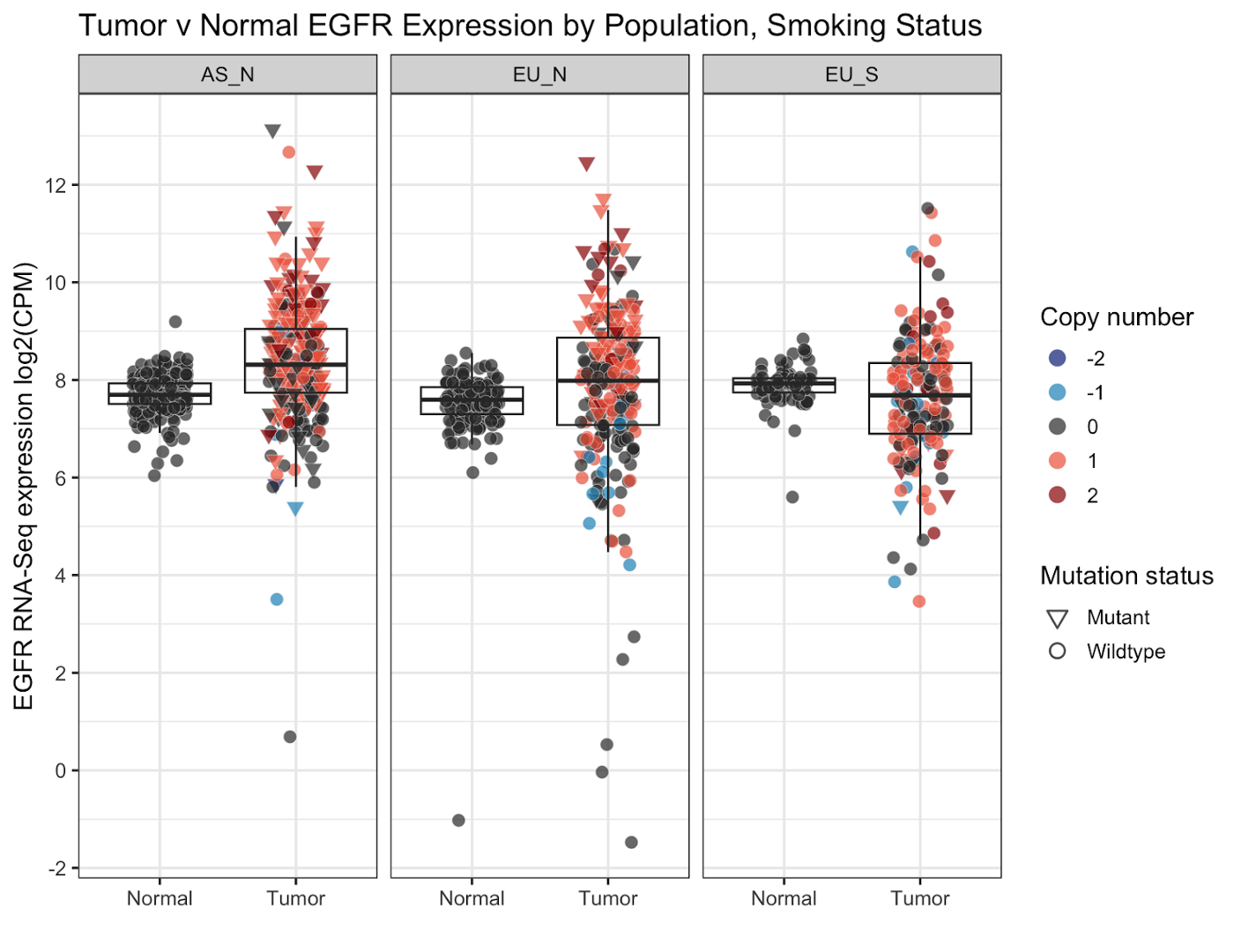
  theme_bw(base_size = 13)
- facet_wrap(): splits data from one graph into multiple based on the value of a given data column. In this case, the column
Group(population group) - labs(): sets labels; x-, y-axis, legend labels, title, subtitle, etc.
- scale_y_continuous(): modifies the y axis including where min/max values, location of axis ticks, apply transformations, etc. Here we change the ticks using a function
pretty_breaksto automatically split the axis into 6 parts. - theme_*(): change the current theme; we chose
theme_bw()for this graph.base_size()sets the base font size.
This is what our graph looks like now:
You can see the graph is now split into the three parts based on population group and smoking status (AS_N, EU_N, and EU_S). We’ve added a title, omitted the x-axis title, redone the y-axis title and axis breaks, and retitled the legend titles. Finally, we’ve changed the gray plotting background to a white one.
Labelling Data Points
This graph is near finalized as it stands, but we can add a few more optional features for the sake of practice. For one, let’s add sample labels to the outlier points. We will do this using the geom_text_repel() function from the ggrepel library.
# add labels
egfr_exp %>%
  ggplot(aes(x=Data_Type,y=Exp))+
  geom_point(aes(fill=as.factor(CNV),shape=Mutation_Status),
             col='gray95',stroke=0.2,size=2.5,alpha=0.7,
             position = position_jitter(width=0.25,height = 0.01,seed = 100))+
  geom_boxplot(outlier.shape = NA,fill=NA)+
  scale_shape_manual(values = c(25,21))+
  guides(fill=guide_legend(override.aes=list(shape=21,size=4)),
         shape=guide_legend(override.aes=list(stroke=0.8,size=3,col='black')))+
  scale_fill_manual(values = c('#0c2c84','#1d91c0','gray20','#ef6548','#990000'))+
  facet_wrap(~Group)+
  labs(x='',y='EGFR RNA-Seq expression log2(CPM)',fill='Copy number',
       shape='Mutation status', title='Tumor v Normal EGFR Expression by Population, Smoking Status')+
  scale_y_continuous(breaks = scales::pretty_breaks(n = 6))+
  theme_bw(base_size = 13)+
  #
  ggrepel::geom_text_repel(aes(label=if_else((Exp>12|Exp<4),Subject,"")),
                           size=3.2,force = 20,
                           position=position_jitter(width=0.25,height = 0.01,seed = 100),
                           min.segment.length = 0.1)
geom_text_repel adds label geoms, and offsets these labels so that labels on nearby points won’t overlap. Because we only want to label the outliers, we’re going to set the label aesthetic to be the sample Subject value if it’s an outlier, and blank if it’s not. We accomplish this with this code: aes(label=if_else((Exp>12|Exp<4),Subject,"")) (read this as ‘if (Exp>12 or Exp<4), label=Subject,else label=”” ’.
Size and force are minor formatting that control size of the label and strength of the label repelling ‘force’. You may notice we set the position variable to match the jittering of the points from before; if we don’t, these labels will point to where the points were without jittering.
With that we are done with our graph. We can save this graph using the ggsave command which will always save the last ggplot generated:
ggsave(filename = 'EGFR_Expression_style2.pdf',width = 7,height = 7,device = cairo_pdf)
The parameters here should be mostly self-explanatory, though note that width and height are in inches by default. Note that as you change the size of the plot, the size of things like labels and points will not scale automatically, they will remain the same size. So if you make the plot very tiny everything will look squished, and if you make it huge it will be hard to read text and data points when the image is scaled down for publication.
Manhattan plot
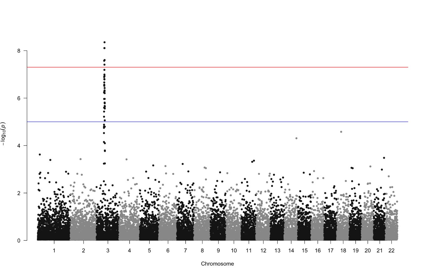
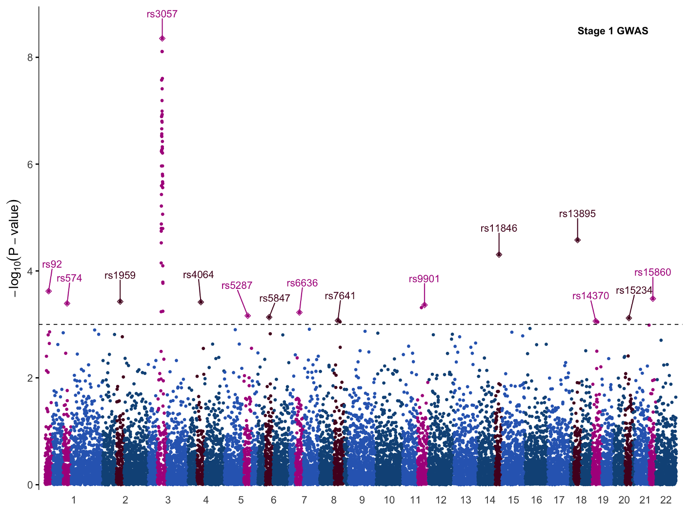
Let’s produce a more complex figure, and one that is likely familiar to any participant who has done GWAS before: a Manhattan plot. The Manhattan plot is generally used to visualize germline SNPs (x-axis) and the strength of their association (y-axis) with a phenotype of interest. SNPs relevant to the phenotype of interest will rise as a peak in the graph. The overall graph is vaguely reminiscent of a city skyline, thus the name ‘Manhattan’ plot.
Within the qqman package you can generate a Manhattan plot with the command qqman::manhattan(gwasResults):
However with these default plotting commands you rarely have the flexibility to customize the plot as you like. To add features like color annotations, shapes, etc. you have much more freedom with ggplot2. For instance you can combine two GWAS plots into one figure with ggplot2 which you cannot do with qqman.
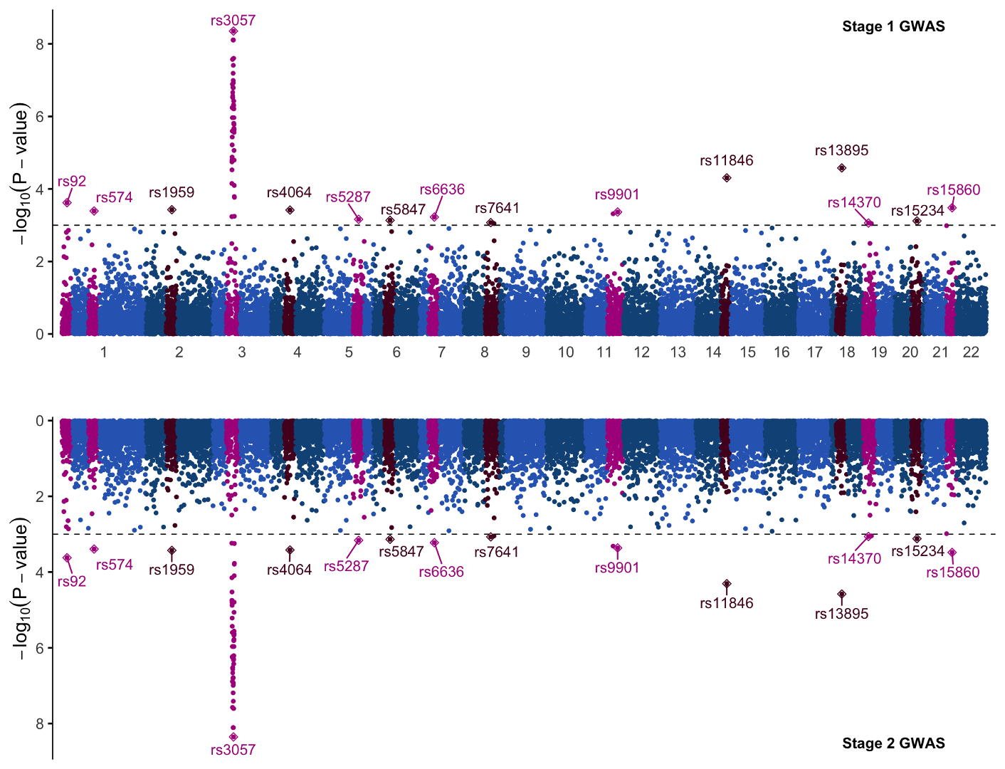
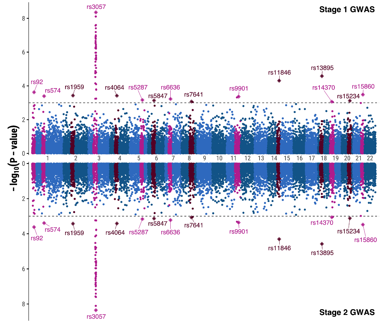
We will make a mirrored Manhattan plot for the sake of demonstration. Mirrored Manhattan plots feature a second, inverted panel and are used for purposes such as displaying GWAS results from two experiments, for two similar or related phenotypes, etc. In this example the top and bottom half of this plot are identical, so we will focus primarily on the code for the top half of the graph and only point out the code changes needed to mirror it.
Load and Transform Data
As before, we need to load data to begin. We will load an example dataset from the qqman R package:
# Load required libraries
library(valr)
library(qqman)

# Load qqman example dataset
data("gwasResults")
gwasResults %>% as_tibble()
# A tibble: 16,470 × 4
   SNP     CHR    BP     P
   <chr> <int> <int> <dbl>
 1 rs1       1     1 0.915
 2 rs2       1     2 0.937
 3 rs3       1     3 0.286
 4 rs4       1     4 0.830
 5 rs5       1     5 0.642
 6 rs6       1     6 0.519
 7 rs7       1     7 0.737
 8 rs8       1     8 0.135
 9 rs9       1     9 0.657
10 rs10      1    10 0.705
#  16,460 more rows
We will next create a very basic GWAS plot.
-
First, the variants are numbered per-chromosome (i.e., starting from 1 on each chromosome), but we need the variants to be numbered continuously across chromosomes so that they line up by chromosome first, then position.
-
We also will color code the variants by which chromosome they are on.
# Create a data frame for plotting
df <- gwasResults %>%
  mutate(end=BP) %>%
  select(chrom=CHR,start=BP,end,gwas_p=P,snp=SNP) %>%
  #mutate(chrom = factor(chrom, levels = 1:22)) %>%
  arrange(chrom, start) %>%
  as_tibble()

# add column `pos` for x axis plotting and a color code by chromosome
df <- df %>%
  mutate(pos=seq_along(start)) %>%
  mutate(chrcolor=if_else(as.numeric(chrom) %% 2 == 0, '#115387','#2F69BE'))
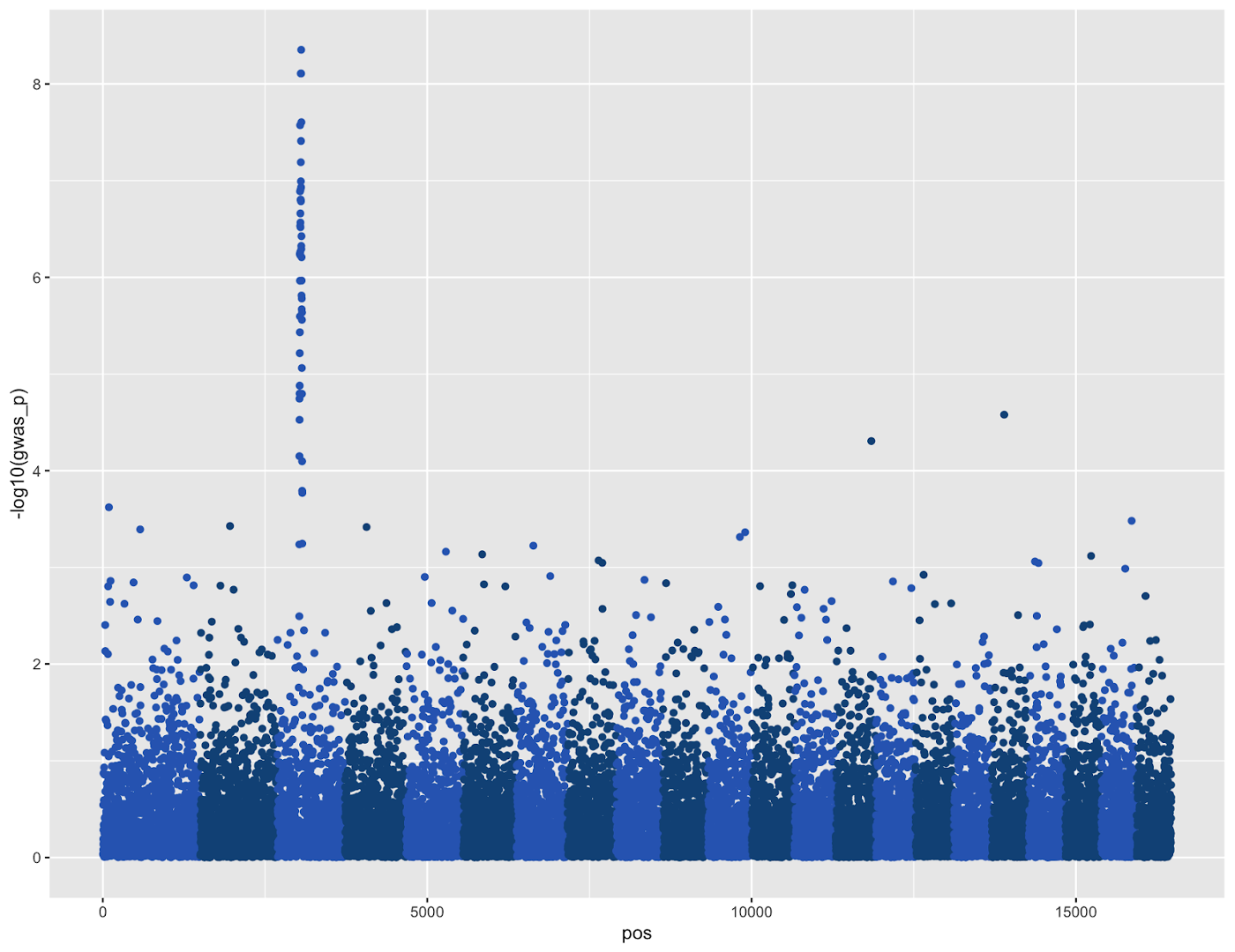
And now we can create the basic plot:
df %>%
  ggplot(aes(pos,-log10(gwas_p),color=chrcolor))+
  geom_point(pch=19)+
  scale_color_identity()
This code is hopefully simple if you were following along before. The only new command is scale_color_identity(), which specifies that the color column chrcolor in the plot aesthetics is not a grouping variable, but rather the colors that should be used when plotting.
This plot is nearly serviceable with some minor touch ups, but it’s a little boring and lacks some annotations needed to be informative. Specifically, we should add:
- chromosome labels
- annotations for significant variants and loci
To add these features we will need to transform our data frame a bit. Since the purpose of this practical is plotting, we will provide the code for these data transformations and explain the process rather than dig into the code itself.
First we will identify GWAS loci. To do this we will select all bases within 100bp of a significant SNP (this is for today’s sake since we are using a small dataset; usually GWAS studies use a 1MB window), then group SNPs to GWAS loci based on their genomic proximity. See the comments above each code chunk to follow the process step-by-step if you wish:
# find gwas locus
pthreshold <- 1e-03
locus_size=100

# isolate significant snps
significant_snps <- df %>%
  filter(gwas_p < pthreshold)

# create bed-formatted table of significant snp positions +/- 100 bases
significant_gwas_locus <- significant_snps %>%
  mutate(start=start-locus_size,end=end+locus_size)

# isolate all SNPs within range of a significant SNP
significant_gwas_locus <- bed_intersect(df,significant_gwas_locus) %>%
  select(chrom,start=start.x,end=end.x) %>%
  unique() %>%
  mutate(gwas_locus=T)

## when one locus ends, the next locus must be >100 bases away; use this info to group nearby bases into loci
significant_gwas_locus <- significant_gwas_locus %>%
  group_by(chrom) %>%
  mutate(prev_bp = lag(start)) %>%
  mutate(distance = ifelse(is.na(prev_bp), NA_integer_, start - prev_bp)) %>%
  ungroup()
#mutate(same_locus=if_else(distance<locus_size,TRUE,FALSE))

## add locus IDs, incrementing the ID number whenever consecutive bases are >100 bases apart
significant_gwas_locus$gwas_id <- NA
gwasid <- 0

for(i in 1:dim(significant_gwas_locus)[1]){
  if(significant_gwas_locus$distance[i]>locus_size | is.na(significant_gwas_locus$distance[i]))
    { gwasid <- gwasid+1 }
  significant_gwas_locus$gwas_id[i] <- gwasid
}
Once that’s done, if you check the data table significant_gwas_locus you can get some idea of what data we created:
# A tibble: 3,183 × 7
   chrom start   end gwas_locus prev_bp distance gwas_id
   <int> <int> <int> <lgl>        <int>    <int>   <dbl>
 1     1     1     1 TRUE            NA       NA       1
 2     1     2     2 TRUE             1        1       1
 3     1     3     3 TRUE             2        1       1
 4     1     4     4 TRUE             3        1       1
 5     1     5     5 TRUE             4        1       1
 6     1     6     6 TRUE             5        1       1
 7     1     7     7 TRUE             6        1       1
 8     1     8     8 TRUE             7        1       1
 9     1     9     9 TRUE             8        1       1
10     1    10    10 TRUE             9        1       1
Most important are the gwas_locus column which stores whether a variant is part of a locus, and the gwas_id which will be used for labeling in the plot.
Now we can join this data with our original gwas table. Since the significant_gwas_locus only stores information on gwas_loci, we’ll also need to set the gwas_locus column to FALSE for all other variants. And at the same time, we’ll give the GWAS loci a special color value so they will stand out in the graph.
# add info to original data frame for plotting significant loci
df <- df %>% left_join(significant_gwas_locus) %>%
  mutate(gwas_locus=if_else(is.na(gwas_locus),FALSE,gwas_locus)) %>%
  mutate(chrcolor=if_else(gwas_locus, if_else(as.numeric(chrom) %% 2 == 0, '#530225','#AE1B8C'),chrcolor))
There are two more data tables that will be useful for plotting. One is a table xdata storing coordinates for where to plot the chromosome numbers (along the x axis in the middle of each chromosome),
xdata <- df %>% group_by(chrom) %>% slice(ceiling(n()/2)) %>% ungroup() %>% select(chrom,pos)
# A tibble: 22 × 2
   chrom   pos
   <int> <int>
 1     1   750
 2     2  2096
 3     3  3211
 4     4  4204
 5     5  5115
 6     6  5966
 7     7  6770
 8     8  7537
 9     9  8273
10    10  8981
# 12 more rows
and the other is ydata which will store labeling information for the most significant variant in each GWAS locus.
ydata <- df %>% filter(gwas_locus) %>% group_by(gwas_id) %>% arrange(gwas_p) %>% slice(1) %>% ungroup()
# A tibble: 15 × 11
   chrom start   end        gwas_p snp       pos chrcolor gwas_locus prev_bp distance gwas_id
   <int> <int> <int>         <dbl> <chr>   <int> <chr>    <lgl>        <int>    <int>   <dbl>
 1     1    92    92 0.000239      rs92       92 #AE1B8C  TRUE            91        1       1
 2     1   574   574 0.000405      rs574     574 #AE1B8C  TRUE           573        1       2
 3     2   459   459 0.000373      rs1959   1959 #530225  TRUE           458        1       3
 4     3   366   366 0.00000000444 rs3057   3057 #AE1B8C  TRUE           365        1       4
 5     4   333   333 0.000383      rs4064   4064 #530225  TRUE           332        1       5
 6     5   611   611 0.000688      rs5287   5287 #AE1B8C  TRUE           610        1       6
 7     6   294   294 0.000733      rs5847   5847 #530225  TRUE           293        1       7
 8     7   258   258 0.000597      rs6636   6636 #AE1B8C  TRUE           257        1       8
 9     8   479   479 0.000848      rs7641   7641 #530225  TRUE           478        1       9
10    11   572   572 0.000433      rs9901   9901 #AE1B8C  TRUE           571        1      10
11    14   550   550 0.0000494     rs11846 11846 #530225  TRUE           549        1      11
12    18   191   191 0.0000264     rs13895 13895 #530225  TRUE           190        1      12
13    19    94    94 0.000869      rs14370 14370 #AE1B8C  TRUE            93        1      13
14    20   396   396 0.000761      rs15234 15234 #530225  TRUE           395        1      14
15    21   469   469 0.000330      rs15860 15860 #AE1B8C  TRUE           468        1      15
Now we have everything we need to make our final plot.
Generate Manhattan Plot
First we will show the command in its entirety, then break it down into its components.
p1 <- df %>%
  ggplot(aes(x=pos,y=-log10(gwas_p),color=chrcolor))+
  geom_point(pch=19,size=1)+
  scale_color_identity()+
  geom_point(data = ydata ,pch=23,size=2)+
  ggrepel::geom_text_repel(data = ydata,aes(label=snp),nudge_y = 0.5)+
  geom_hline(yintercept = -log10(pthreshold),linetype=2,size=0.4)+
  annotate(geom = 'text',x = 0.9*max(df$pos),y=8.5,label="Stage 1 GWAS",fontface = "bold")+
  scale_y_continuous(breaks = c(0,2,4,6,8),expand = c(0.01,0.01))+
  scale_x_continuous(breaks = xdata$pos,labels = xdata$chrom,expand = c(0.01,0.01))+
  labs(x='',y=expression(-log[10](P-value)))+
  theme_minimal(base_family = 'Arial',base_size = 14)+
  theme(panel.grid = element_blank(),
        axis.line.y = element_line(linewidth = 0.4),
        axis.ticks.y=element_line())
Let’s examine the pieces of the code:
df %>%
  ggplot(aes(x=pos,y=-log10(gwas_p),color=chrcolor))+
  geom_point(pch=19,size=1)+
  scale_color_identity()+
This is the same code as before and sets the x and y axes, draws the points in the plot, and colors them according to the chrcolor column
  geom_point(data = ydata ,pch=23,size=2)+
  ggrepel::geom_text_repel(data = ydata,aes(label=snp),nudge_y = 0.5)+
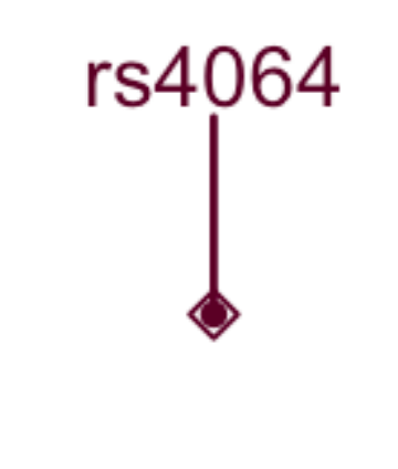
These two lines annotated the significant SNPs. You may notice that both commands contain the argument data=ydata which is the dataframe where we stored our labelling information. If you closely examine the GWAS plot you’ll see that the significant SNPs have a diamond around them; this is what we accomplish with the line geom_point(data = ydata ,pch=23,size=2) where pch specifies the point shape.
geom_text_repel() controls the labeling, which we covered earlier. One thing to note is that the nudge_y argument controls the direction in which labels are repelled, in this case above the labeled point. If you do not specify, the labels can be repelled in any direction.
geom_hline(yintercept = -log10(pthreshold),linetype=2,size=0.4)+
This code creates the dashed line showing the threshold for significance.
annotate(geom = 'text',x = 0.9*max(df$pos),y=8.5,label="Stage 1 GWAS",fontface = "bold")+
This code creates the annotation in the top right. Label and fontface=”bold” are self explanatory, but one thing to point out is controlling the positioning. We set the x-position to 90% of the maximum value on the x-axis with 0.9*max(df$pos), and the y-position to 8.5 on the y axis.
  scale_y_continuous(breaks = c(0,2,4,6,8),expand = c(0.01,0.01))+
  scale_x_continuous(breaks = xdata$pos,labels = xdata$chrom,expand = c(0.01,0.01))+
  labs(x='',y=expression(-log[10](P-value)))+
These commands we used previously in our boxplot. With scale_x_continuous and scale_y_continuous we explicitly set the labels on the axes. In the scale_x_continuous command you’ll notice we use xdata$pos and xdata$chrom to set the chromosome labels from the dataframe we made earlier. xdata$pos stores the midpoint of each chromosome so that the labels are centered. And the expand argument expands the plotting region a bit on all sides so that there are fewer gaps.
The labs command sets the axis labels as before.
  theme_minimal(base_family = 'Arial',base_size = 14)+
  theme(panel.grid = element_blank(),
        axis.line.y = element_line(linewidth = 0.4),
        axis.ticks.y=element_line())
Lastly we set the theme of the plot with theme_minimal with font ‘Arial’ and size 14 font.
The theme command contains general plot theme settings, such as panel.grid = element_blank() which removes the gridlines for better visibility. The minimal theme that we’ve chosen is good, but it removes the y-axis ticks which we’d prefer to keep. To restore those, we set axis.line.y = element_line(linewidth = 0.4),axis.ticks.y=element_line()in the theme command.
Make sure to save this plot to variable p1.
Mirror the Plot
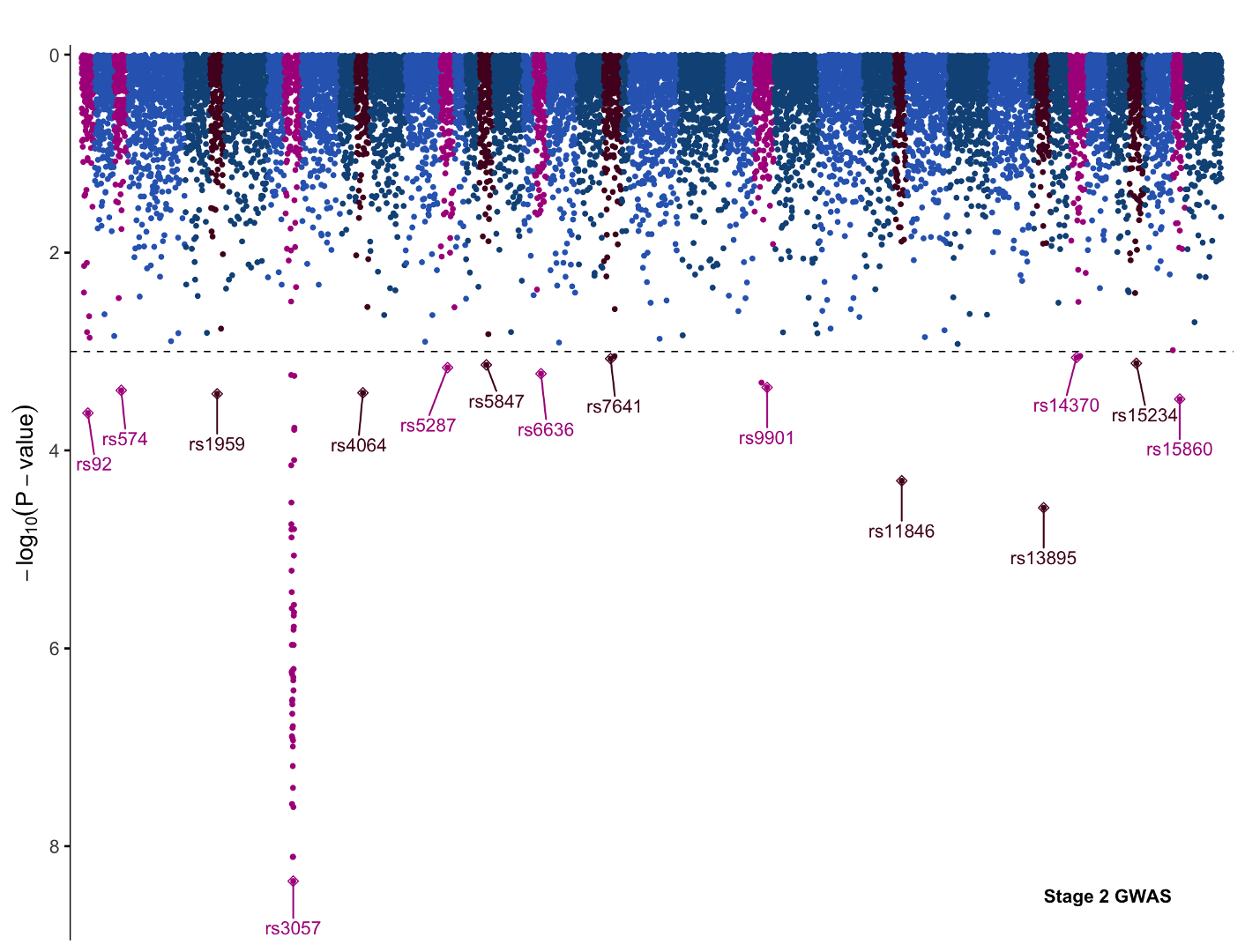
We could now save this plot as is, but let’s try turning this plot into a panel as though we were performing a two-stage GWAS. To this end we will quickly generate a mirror image plot that we can display below, and we will save it to variable p2. Starting with the same code for the first Manhattan plot, we can make the following changes:
- scale_y_continuous->scale_y_reverse
- ggrepel::geom_text_repel: nudge_y = 0.5 -> nudge_y= -0.5
- theme(axis.text.x = element_blank())
With these changes the y scale will invert, the direction the SNP labels repel is now down away from the data rather than up into it, and we hide the x axis with theme(axis.text.x = element_blank()) since the x axis from the previous graph will serve for both plots.
Now if you’ve saved the first graph to p1 and this inverted graph to p2, we can combine them into one single plot with the plot_grid function from cowplot. In its most basic form, the command looks like so:
Create Manhattan Panel
pall <- cowplot::plot_grid(p1,p2,
                  ncol = 1, axis = 'lr')
We just specify the graphs, p1 and p2, then specify how we want them positioned: axis=”lr” means the left and right margins of the plots are aligned, and ncol=1 limits the grid to only one column of graphs which will force the figures to align vertically.
If you just plot like this, however, you’ll find that the figure looks a little off. This is because the original plotting margins per figure are too large.
To fix this we need to alter the margins, which we can do within plot_grid, like so:
pall <- cowplot::plot_grid(
p1+theme(plot.margin = margin(t=4,b=-12,)),
p2+theme(plot.margin = margin(t=-12,b=4)),
ncol = 1, axis = 'lr')
This will decrease the margin between the plots, ensuring that the x-axis labels are near each graph.
We’re now done with the plot in R. We can save this plot like before:
ggsave(filename = 'Manhattan_plot_style.pdf',plot = pall,width = 9,height = 8,device = cairo_pdf)
Practice Manhattan Plot
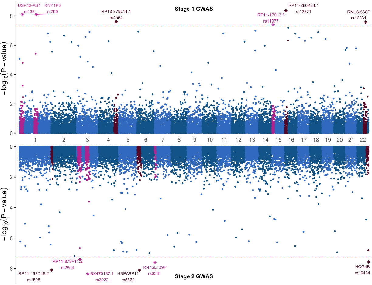
At this point we challenge you to adapt the code we just covered for the Mahattan plot to make a new plot using new data and a few plotting changes. Using the data in gwasResults1 (top half) and gwasResults2 (bottom half of plot):
- Change the significance threshold to 5e-08
- Change the color of significance threshold line from black to red
- Add gene names to the SNP labels using the provided annotation columns
Much of the code for transforming the data leading up to the plot will stay the same, so you can start with that foundation and make the few necessary changes. Focus on getting the top half of the plot right first, then the second.
If you get stuck, here is one solution:
Solution
- Step 1: Transform both datasets
library(tidyverse)
library(ggsci)
library(ggrepel)
library(scales)
library(cowplot)
library(valr)
library(qqman)

# THIS PATH WILL VARY ON PC vs MAC
load('~/Downloads/Practical_12/gwasResult_examples.RData')

## store the steps to transform data into a function
## optional, but lets us use this function x2 rather than copy-pasting duplicate code
transform_manhattan_data<-function(gwasData){
  # Create a data frame for plotting
  df <- gwasData %>%
    mutate(end=BP,SNP=paste0(Gene,"\n",SNP)) %>% #### CHANGE 1 -----------------
    select(chrom=CHR,start=BP,end,gwas_p=P,snp=SNP) %>%
    #mutate(chrom = factor(chrom, levels = 1:22)) %>%
    arrange(chrom, start) %>%
    as_tibble()

  # add column `pos` for x axis plotting and a color code by chromosome
  df <- df %>%
    mutate(pos=seq_along(start)) %>%
    mutate(chrcolor=if_else(as.numeric(chrom) %% 2 == 0, '#115387','#2F69BE'))

  # find gwas locus
  pthreshold <- 5e-08 #### CHANGE 2 -----------------
  locus_size=100

  significant_snps <- df %>%
    filter(gwas_p < pthreshold)

  # create bed-formatted table of significant snps+-locus_size
  significant_gwas_locus <- significant_snps %>%
    mutate(start=start-locus_size,end=end+locus_size)

  # pull all SNPs within range
  significant_gwas_locus <- bed_intersect(df,significant_gwas_locus) %>%
    select(chrom,start=start.x,end=end.x) %>%
    unique() %>%
    mutate(gwas_locus=T)

  ## add the Locus ID to the gwas locus
  ## use gap between consecutive variant entries to identify where one locus ends, next begins
  significant_gwas_locus <- significant_gwas_locus %>%
    group_by(chrom) %>%
    mutate(prev_bp = lag(start)) %>%
    mutate(distance = ifelse(is.na(prev_bp), NA_integer_, start - prev_bp)) %>%
    ungroup()
  #mutate(same_locus=if_else(distance<locus_size,TRUE,FALSE))

  ## increment locus id when bp gap > 1
  significant_gwas_locus$gwas_id <- NA
  gwasid <- 0
  for(i in 1:dim(significant_gwas_locus)[1]){
    if(significant_gwas_locus$distance[i]>locus_size | is.na(significant_gwas_locus$distance[i]))
    { gwasid <- gwasid+1 }
    significant_gwas_locus$gwas_id[i] <- gwasid
  }

  # add info to original data frame for plotting significant loci
  df <- df %>% left_join(significant_gwas_locus) %>%
    mutate(gwas_locus=if_else(is.na(gwas_locus),FALSE,gwas_locus)) %>%
    mutate(chrcolor=if_else(gwas_locus, if_else(as.numeric(chrom) %% 2 == 0, '#530225','#AE1B8C'),chrcolor))

  return(df)
}

# transform both datasets with the function
df<-transform_manhattan_data(gwasResults1)
df2<-transform_manhattan_data(gwasResults2)
- Step 2: Make plots
# xdata stores position of chromosome x-axis labels, ydata stores labeling information
xdata <- df %>% group_by(chrom) %>% slice(ceiling(n()/2)) %>% ungroup() %>% select(chrom,pos)
ydata <- df %>% filter(gwas_locus) %>% group_by(gwas_id) %>% arrange(gwas_p) %>% slice(1) %>% ungroup()

p1 <- df %>%
  ggplot(aes(x=pos,y=-log10(gwas_p),color=chrcolor))+
  geom_point(pch=19,size=1)+
  scale_color_identity()+
  geom_point(data = ydata ,pch=23,size=2)+
  ggrepel::geom_text_repel(data = ydata,aes(label=snp),nudge_y = 0.5,size=3)+
  # change line color
  geom_hline(yintercept = -log10(pthreshold),linetype=2,size=0.4,color="red")+
  # move graph labels to middle to avoid text overlap
  annotate(geom = 'text',x = 0.5*max(df$pos),y=8.5,label="Stage 1 GWAS",fontface = "bold")+
  scale_y_continuous(breaks = c(0,2,4,6,8),expand = c(0.01,0.01))+
  scale_x_continuous(breaks = xdata$pos,labels = xdata$chrom,expand = c(0.01,0.01))+
  labs(x='',y=expression(-log[10](P-value)))+
  theme_minimal(base_family = 'Arial',base_size = 14)+
  theme(panel.grid = element_blank(),
        axis.line.y = element_line(linewidth = 0.4),
        axis.ticks.y=element_line())

# change label info
ydata <- df2 %>% filter(gwas_locus) %>% group_by(gwas_id) %>% arrange(gwas_p) %>% slice(1) %>% ungroup()

# same as before, but reversed with the second dataset
p2 <- df2 %>%
  ggplot(aes(pos,-log10(gwas_p),color=chrcolor))+
  geom_hline(yintercept = -log10(pthreshold),linetype=2,size=0.4,color="red")+
  geom_point(pch=19,size=1)+
  geom_point(data = ydata ,pch=23,size=2)+
  ggrepel::geom_text_repel(data = ydata,aes(label=snp),nudge_y = -0.5,size=3)+
  annotate(geom = 'text',x = 0.5*max(df2$pos),y=8.5,label="Stage 2 GWAS",fontface = "bold")+
  scale_color_identity()+
  scale_y_reverse(breaks = c(0,2,4,6,8),expand = c(0.01,0.01))+
  scale_x_continuous(breaks = xdata$pos,labels = xdata$chrom,expand = c(0.01,0.01),position = 'top')+
  labs(x='',y=expression(-log[10](P-value)))+
  theme_minimal(base_family = 'Arial',base_size = 14)+
  theme(panel.grid = element_blank(),axis.line.y = element_line(linewidth = 0.4),
        axis.ticks.y=element_line(),axis.text.x = element_blank())

pall <- cowplot::plot_grid(p1+theme(plot.margin = margin(t=4,b=-12)),
                           p2+theme(plot.margin = margin(t=-12,b=4)),
                           axis = 'lr',ncol = 1)
Editing Figures with Adobe Illustrator
There might still be some little things about the Manhattan plot you still want to change. For instance, the y axis labels are the same, maybe it would be better to just have one label. This is a little tricky using R, but very easy with an SVG image editor like Adobe Illustrator.
